LOADING
Work Case Studies About Blog Get in touch

Lead UX/UI Product Designer · London

Designing
digital things
people love

I craft pixel-perfect digital experiences across fintech, enterprise SaaS, and e-commerce — from first sketch to shipped product. 15+ years of turning complex problems into elegant solutions.

15+
Years experience
50+
Projects shipped
4
Core industries

Selected Work

— 11 Projects
The Human Digital Bank
01
FintechAIEnterpriseMobile
Cynergy Bank
Agentic AI Transformation
Sustainable Banking
02
FintechClimateEnterpriseSaaS
OakNorth Bank
Risk modelling tools for sustainable banking
Preqin Pro
03
FintechSaaSEnterprise
Preqin Pro - Blackrock
Replatforming the world's leading alternative assets data platform.
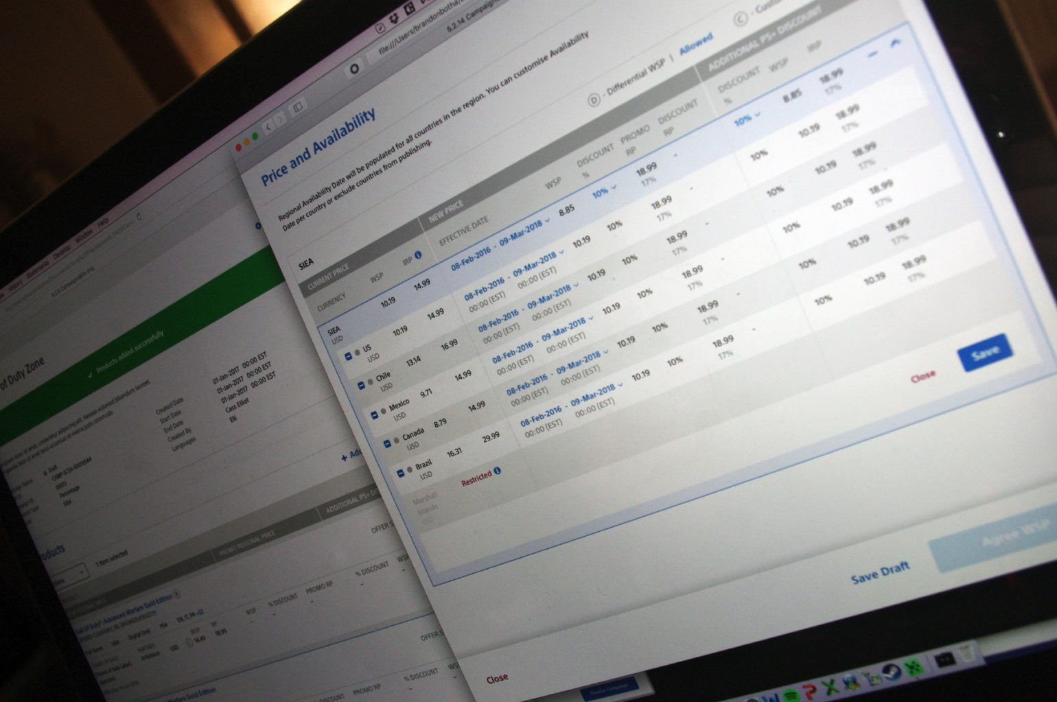
Jellyfish BT project
04
EnterpriseAIE-commerce
Jellyfish / BT
AI-driven social media campaign management platform
Chelsea Apps
05
FintechMobile
Vanquis Bank / Chelsea Apps
How we built a 5-star App
Banking Application
06
FintechEnterprise
HCL Technologies / Deutsche Bank
Building scalable design systems.

Selected work

In-depth
case studies

A deeper look at how I think, how I work, and the decisions behind each project — from discovery to delivery. Every project listed below involved real constraints, real users, and real consequences.

01
Fintech Enterprise AI 2023

The Human Digital Bank

A complete reimagining of personal and business banking — built around genuine human needs and Agentic AI rather than legacy architecture. I led UX strategy, information architecture, and design system creation across 34 months of embedded team work.

Read case study →
The Human Digital Bank
02
Fintech SaaS 2022

Sustainable Banking & Climate Risk

How do you communicate complex climate risk data for credit lending teams? This project explored ways to surface actionable sustainability insights within commercial lending — without overwhelming users with heavy data.

Read case study →
Sustainable Banking
03
Fintech Enterprise 2020

Preqin Pro — Digital Transformation

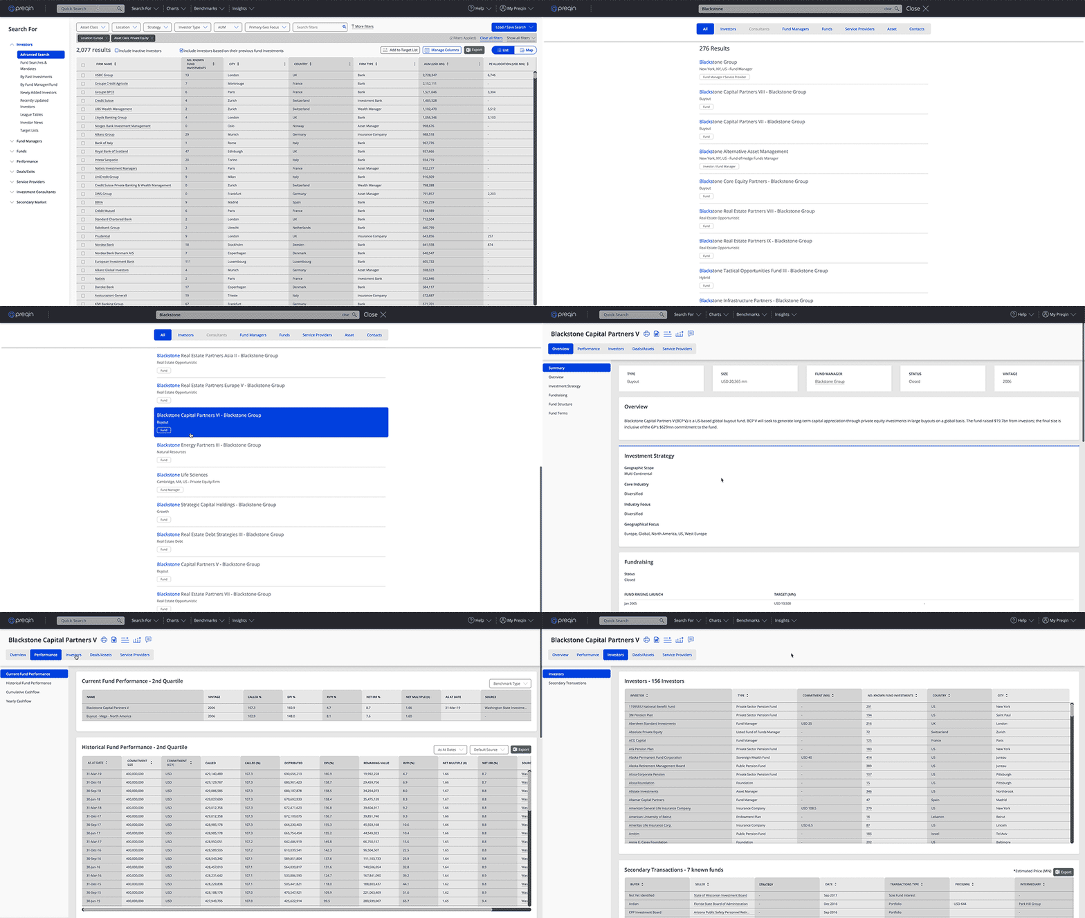
Preqin's flagship data platform serves 90,000+ professionals across private equity, hedge funds, and real assets. I led the end-to-end redesign — moving from a dated interface to a modern, research-driven platform that surfaced data with clarity and speed.

Read case study →
Preqin Pro
04
Enterprise AI 2021

Disruptive tech at it's finest

Social media AI-driven zero-to-one platform.

Read case study →
Jellyfish
05
Enterprise Fintech 2020

Building scalable Design Systems

I delve under the hood into what it takes to create a scalable design system

Read case study →
DB
06
Enterprise Fintech 2018

The road to a 5-star app

Design, iterate, test ––––> Repeat

Read case study →
Vanquis
Portrait

About me

I design things that make sense for the people who use them

I'm a South African-born, London-based UX/UI Product Designer with over 15 years of experience leading product design across fintech, enterprise software, e-commerce, and digital agencies.

My approach starts with empathy and ends with precision. I believe the best interfaces feel inevitable — like they couldn't have been designed any other way. Getting there takes research, iteration, collaboration, and an obsessive attention to detail.

I've worked embedded in product teams, led design at agencies, and consulted independently. I'm comfortable working across the full stack of design — from early-stage discovery and strategy through to polished UI and developer handoff.

Capabilities

What I bring to a team

UX Research & StrategyLead
Interaction DesignLead
Design SystemsLead
Visual & UI DesignLead
Figma & PrototypingExpert
Service DesignSenior
AI Product DesignSenior
Mobile-First DesignExpert
Design LeadershipLead
Stakeholder ManagementSenior
User Testing & ValidationExpert
Developer CollaborationSenior

History

Consulting Projects

2023 — now
Agentic Applications + Online Banking App & Web
Cynergy Bank · London
Leading design across banking, enterprise, and SaaS projects. Recent engagements include banking redesigns, AI-powered product tools, and large-scale design system work
2022 — 2023
ONCI Risk Modelling Applications
OakNorth Bank · London
Leading design across banking risk enterprise and SaaS projects. Climate tools and large-scale design system work
2021-2022
Risk & Compliance Applications
HCL · Deutsche Bank · London
Third UX consultancy leading the HCL design team on enterprise Saas risk and compliance applications for Deutsche Bank’s corporate banking division
2020-2021
AI-driven Social Media Campaign Booking Platform
Jellyfish · London
Lead service design across prototypes to test the hypothesis for a new AI-driven social media advertising platform behind a pay-wall portal with baked in AI tools
2020 — 2021
Design System Design and Enterprise Payable Finance Platform Design
HCL · Deutsche Bank · London
Second UX consultancy to lead zero-to-one apps - spearheading design efforts
2020 — 2020
Enterprise Payment System Design
Keytree (Deloitte) · London
Designed a JSOX-compliant Enterpise payments platform for National Car Parks
2019 — 2021
Enterpise e-commerce Replatforming and AIML Application
Preqin (Blackrock) · London
Second spell as lead UX for the mobile-first re-platforming of preqin.com, integrating Shopify e-commerce journeys and designing AIML applications
2018 — 2018
Payment Reporting System Design
HCL · Deutsche Bank · London
Designing enterpise payment monitoring systems for risk and compliance
2018 — 2018
Enterprise SaaS Digital Transformation
Preqin (Blackrock) · London
Helping define Preqin's flagship product, Preqin Pro, taking complex requirements and creating simple and intuitive user journeys, ensuring paywall users like investors or fund managers can access their data on-demand from the world's largest private capital data provider
2017 - 2017
Mobile App Replatforming
Chelsea Apps · Vanquis Bank · London
Cross-platform lead design role to design the new online bank and native iOS/Android 5-star banking app
2016 - 2017
Enterpise Digital Transformation
Portaltech · Sony PlayStation · London
Facilitated the design of "PlayStation Partners", a platform that empowers game developers to create and manage their titles across the PS network
2012 — 2017
Enterpise, SaaS, E-commerce, Fintech and Commercial Web Projects and Applications
Various Contracts · London
A mixture of contracts with: Zone Agency, Splendid Agency, Filter Marketing Agency, Biglight Agency, Wunderman Agency, Immaculate Agency, Wildhorse Agency, Morrisons, Market Tech and Coty Beauty

Writing

Thoughts on
design, craft
& the industry

I write about UX process, design leadership, fintech product design, and the occasional opinion on where the industry is heading. Infrequently, but thoughtfully.

All fintechs look the same
Design Process

Why most fintech apps feel like they were designed for compliance, not people

After 15 years designing financial products, I've noticed the same pattern — great technology, poor emotional design. Here's how I think about bridging that gap.

January 2026 · 6 min read

Designing with AI
AI & Design

Designing with AI: what's changed and what hasn't

AI tools are everywhere in design workflows now. My honest take after a year of using them.

May 2025 · 10 min read

UX Lessons
Fintech

The UX lessons hidden inside the best banking apps

A teardown of Monzo, Revolut, and Starling — what they got right and what legacy banks keep missing.

September 2025 · 7 min read

Cynergy Bank
Fintech

My experience at Cynergy Bank

Building consistency at scale and the often rocky road to innovation

April 2026 · 9 min read

OakNorth Bank
Fintech

My experience at OakNorth Bank

Why risk modelling has become critical in today's highly volatile world

May 2025 · 8 min read

Jellyfish logo
Fintech

My experience at Jellyfish

Disruptive tech at it's finest

March 2026 · 7 min read

Get in touch

Let's make something worth making

Whether you need a lead designer for a product build, a UX audit, or just want to talk through a design problem — I'm always happy to have an honest conversation.

Email
brandon@brandonbotha.net
Based in
London, UK
Availability
Open to new projects

I typically respond within 48 hours.

Agentic AIService DesignProduct Strategy2025–2026

Agentic AI Transformation in Commercial Lending

Designing the first AI-native credit origination and decisioning workspace

Client
Cynergy Bank · Challenger Bank
Duration
32 months
My role
Lead/Principal UX/UI Designer
Team size
5 teams, 30 devs, 3 designers, 5 BAs, 1 PO

Reimagining how credit lending teams work with AI

In 2025 I led the discovery and product design of an Agentic AI platform for the Business Credit Lending team, exploring how AI could fundamentally reshape credit origination, underwriting workflows, and document intelligence.

Rather than treating AI as a "chat layer", the objective was to design an operational AI system embedded directly into lending workflows, capable of interacting with core banking systems, retrieving documentation, and assisting with credit memo creation end-to-end.

Reduce manual effort, accelerate decision-making, and centralise fragmented lending workflows into a single intelligent workspace.

Understanding real lending operations

I ran a series of workshops with credit lending SMEs to map how deals were actually processed in practice. This revealed a highly fragmented workflow:

  • Information scattered across multiple internal systems
  • Manual retrieval of documents across portals
  • Repetitive credit memo drafting and formatting
  • High cognitive load when assessing deal risk
  • Heavy reliance on institutional knowledge rather than system intelligence

From this, I mapped the end-to-end lending journey, identifying key "decision moments" where AI could intervene meaningfully rather than superficially.

Agentic AI discovery

From workflows to agentic systems

The experience was designed as a multi-agent workspace, not a traditional UI. Key capabilities designed and prototyped:

  • Deal Origination Agent – analyses incoming applications and summarises risk signals
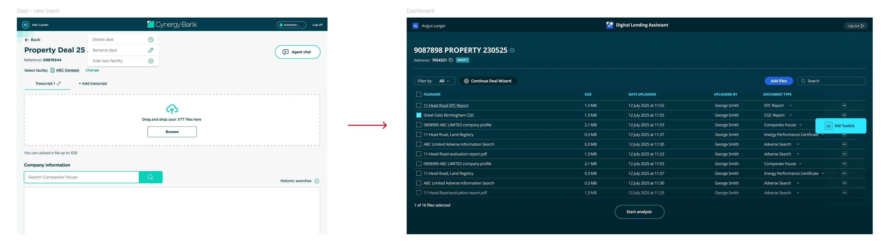
  • Document Intelligence Layer – aggregates and retrieves deal-related documentation via API integrations
  • Credit Memo Generator – produces structured credit memos with editable AI assistance
  • Conversational Deal Interface – allows users to query deals via natural language
  • Audit & Traceability Layer – ensures compliance visibility across all AI outputs

We rapidly iterated clickable prototypes directly in workshops, refining the system in real time with underwriters and relationship managers. This allowed us to validate the concept within weeks and secure funding approval for build.

Design iterations

From prototype to production system

Once validated, the platform was evolved into a SaaS-ready internal AI tool. Key design decisions included:

  • Extending the existing Cynergy design system into a dedicated AI product skin
  • Creating a separate visual language for AI interactions (clarity, trust, and traceability)
  • Designing conversational UI patterns for structured financial data
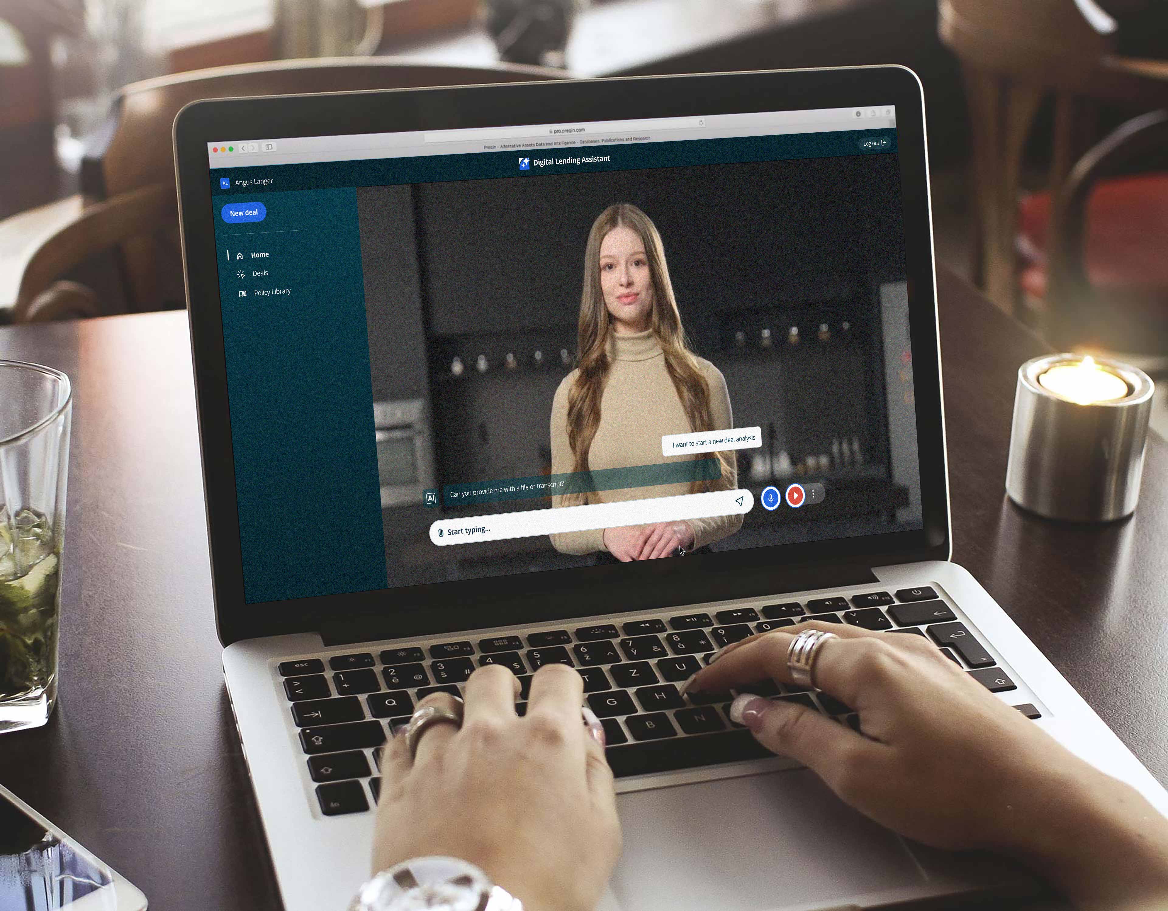
  • Supporting multimodal interaction (text + voice + experimental AI avatar interface)

The product was integrated with SSO and deployed directly into the credit lending team’s daily workflow.

Further design iterations Animated AI flow

From assistant to operational engine

The Agentic AI system became a core part of the credit lending workflow, enabling users to:

  • Generate and edit credit memos significantly faster
  • Access deal documentation instantly via natural language
  • Reduce dependency on manual system navigation
  • Improve consistency of underwriting outputs
  • Centralise fragmented systems into one workspace

The platform has since evolved into a foundational AI capability within the bank and has been recognised in industry award shortlists, including Computing AI Awards 2026 (Best AI Project nomination).

First principles

The organisation had strong banking fundamentals but a fragmented digital experience: no modern mobile app at launch, legacy online banking with poor usability, rising support tickets, and low customer satisfaction. Systems had been designed around regulatory structure, not user needs.

My role expanded to leading end-to-end UX for a new mobile banking app, a redesigned online banking platform, and a unified design system across product teams.

Legacy platform

Identifying systemic UX failures

Key issues identified across the existing platform:

  • Authentication friction causing high call centre volume
  • Overloaded dashboards with no prioritisation
  • Business banking layered onto personal banking — not designed independently
  • High cognitive load across core journeys

A major insight was that onboarding and login were trust problems, not usability problems.

Rebuilding from first principles

We adopted a greenfield redesign approach, rebuilding the experience from scratch using Flutter. This included re-architecting core journeys across personal and business banking, reworking integration with core banking systems (including Equation), aligning UX flows with operational and compliance constraints, and running cross-functional workshops across engineering, operations, and product.

New online banking platform New banking app

Design system — scaling consistency across teams

To address fragmentation across engineering teams, I led the creation of a structured design system: 140+ components documented for design and engineering, with accessibility embedded at component level. The system was iteratively evolved from Figma into a production-ready system, and integrated with Flutter Widgetbook to align design and code parity — significantly reducing duplication, inconsistency, and QA issues across squads.

Widgetbook

Key product capabilities shipped

Across app and online banking platforms, we delivered:

  • App-based login replacing external authentication device
  • Fast-track onboarding for savings products
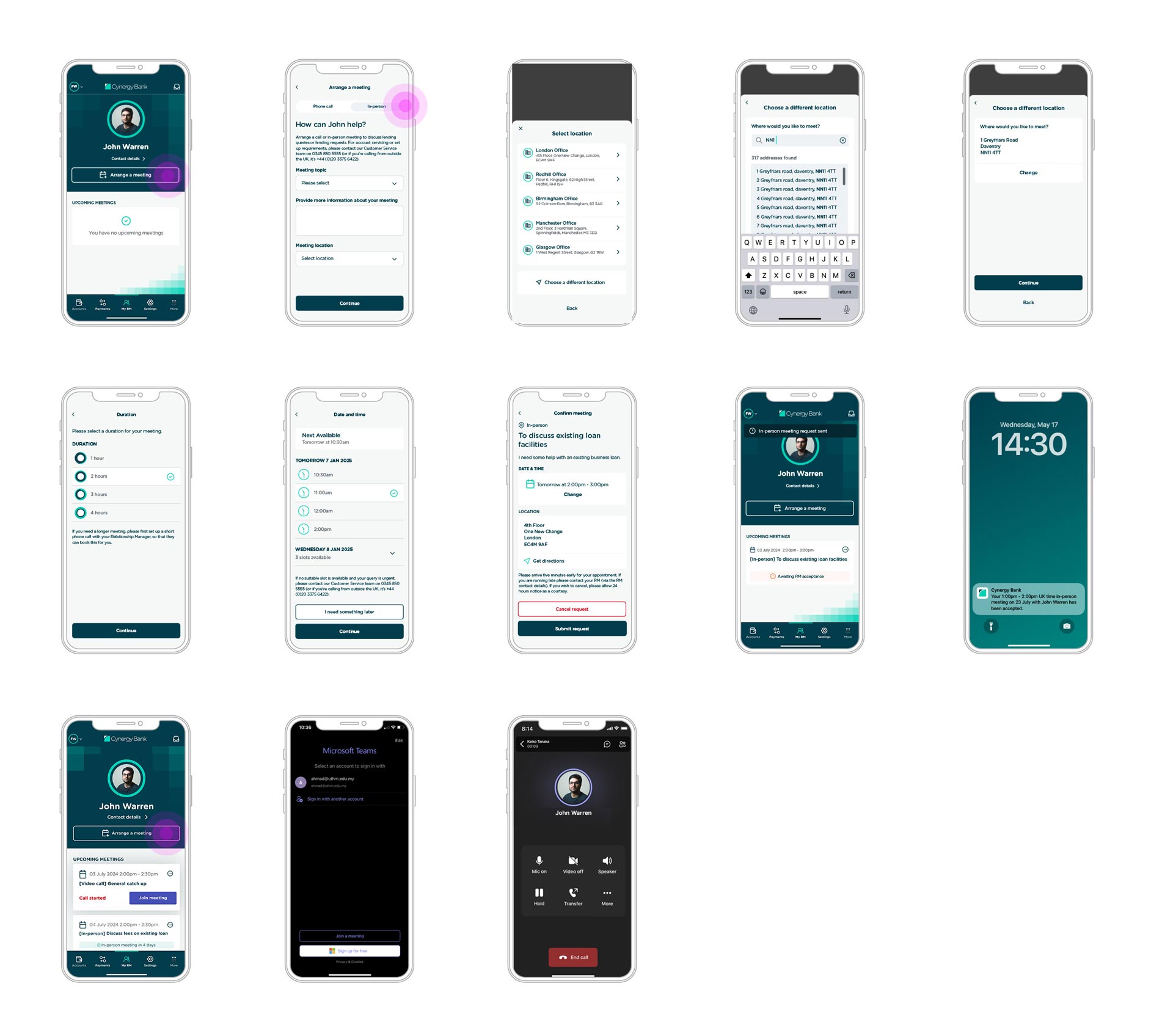
  • RM video appointment booking portal
  • Real-time notifications (push + SMS)
  • Full payments suite (Faster Payments, CHAPS, SWIFT, SEPA)
  • Bulk payments for business users
  • Multi-authorisation workflows
  • Enriched payment data via Tapix integration
Key pages

Improving trust and reducing friction

One of the most impactful changes was replacing the broken authentication system with app-based deep-link authentication, which:

  • Reduced login-related support tickets
  • Improved customer trust signals (including Trustpilot uplift)
  • Increased mobile app adoption significantly
New app-based login flow User flow

From launch to maturity

Post-launch, the focus shifted to stabilising releases across scaling teams, migrating the design system fully into Figma, improving component governance via Widgetbook, and addressing QA and consistency issues across the Flutter implementation. This phase established a long-term scalable foundation for digital banking delivery.

Payment flows
Next case study
OakNorth - Sustainable Banking
FintechClimateEnterprise2023

OakNorth Bank

During my lead contract role at ONCI, I helped design and launch a suite of 3 scalable Saas enterprise applications: OakNorth Climate, Scenarios and Monitoring. After successfully launching these products in 2022 and 2023, a number of banks have adopted the new borrower risk applications. Let me walk you through why these apps are crucial to banks in our new volatile world.

Client
OakNorth Bank · Credit Intelligence Team
Duration
13 months
My role
Lead/Principle UX/UI Designer
Team size
3 teams, 20 devs, 3 designers, 3 BAs, 1 PO
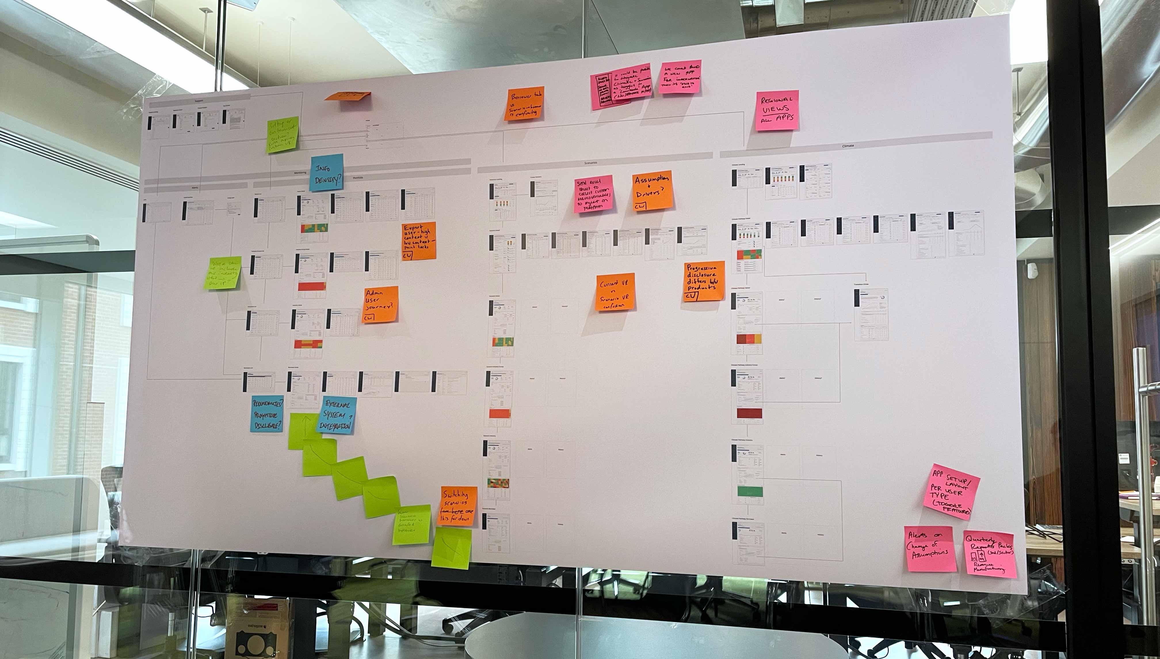
ONCI journey map

The importance of risk modelling

Some $1.5 trillion in mortgages are currently up for renewal, a potential time bomb as higher interest rates push down property values. The war in Ukraine, hyper-inflation, supply-chain issues, strict climate legislation moving towards NetZero 2050 and a general lag in uptake from economies still reeling from Covid, are all contributing to severe pressure on markets, banks and borrowers. And that’s where risk modelling comes in handy. Over the course of around a year or so I helped OakNorth design a suite of apps that would model this adverse risk on credit lending portfolios.

OakNorth have created what they call ‘the forward look’ – an algorithm that is one of the most sophisticated in the banking industry at present. It models macroeconomic impacts on industrial levels, which then impact on borrowers, in whichever industry they may be in. Considering that a lot of borrowers are feeling the strain currently, the new apps give banks foresight into how those borrowers will cope with those strains later down the line. It is basically a ‘crystal ball’. This is a coveted resource in the financial industry and a lot of banks are falling over themselves to try and build something that half works – let alone does it to the accuracy of OakNorth. We are talking an accuracy rate of around 80%. This is a game changer.

Interest Rate Gap Interest Rate Risk

"We had built a bank that could do everything. The problem was that nobody could figure out how."

— CPO, project kick-off

Creating an ecosystem

OakNorth had been sitting on a vision for at least a year or so prior to when they asked me to come on board in early May 2022. I was interested in Risk and they had some ideas about risk apps. A perfect combo.

Although they have been quietly building a number of other apps, the plan was to sell the new ONCI risk apps to other banks. The design director, Andy Hajitheodoulou, who I would be working closely with, joined around 3 months before me and had started pulling together that vision – after some early discovery workshops – the vision being to unify 3 greenfield apps that were being designed independently by 3 separate teams based in separate locations. There would be many more workshops though, mostly technical workshops for each feature of the apps – but we had an idea to work with.

ON Climate ON Climate ON Climate ON Climate ON Climate ON Climate ON Climate ON Climate

App
eco­sphere


ON Climate

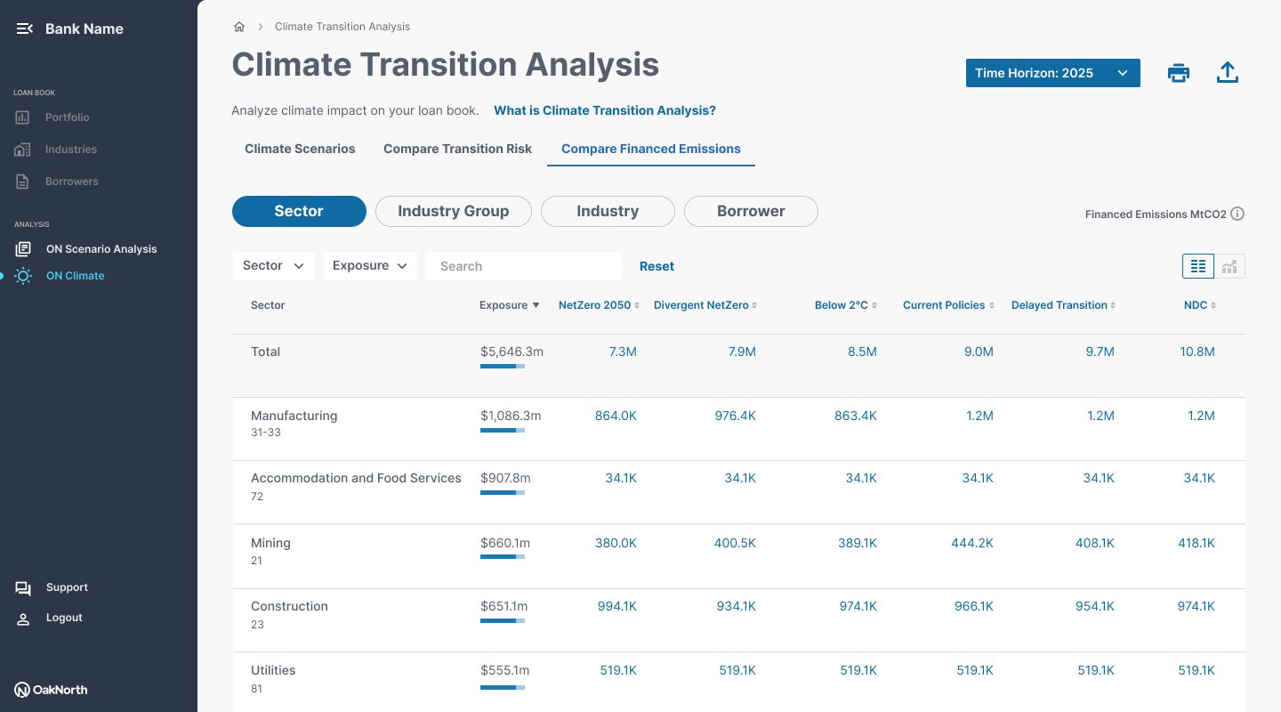
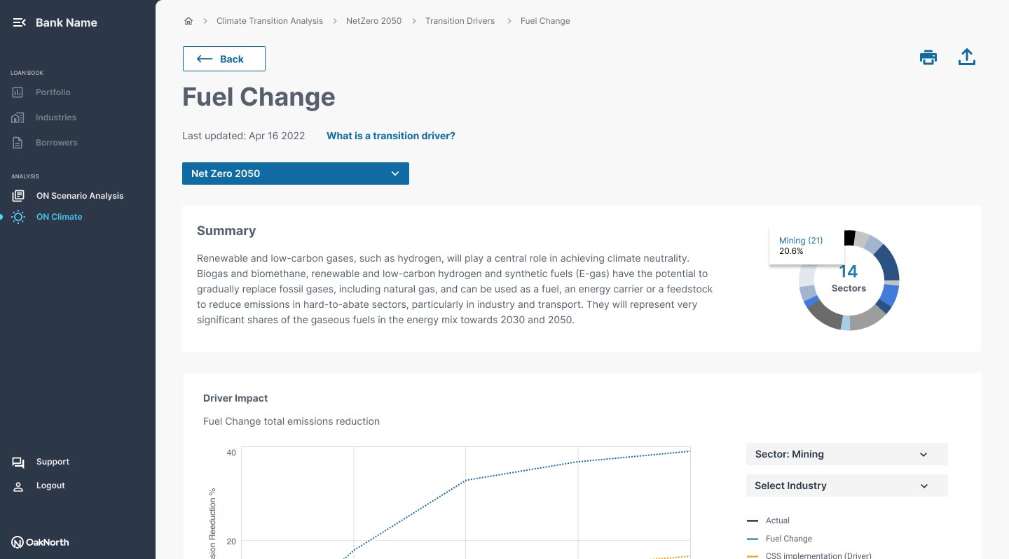
Analyse climate transition risk on banks loanbooks and spot opportunities to lend to reduce climate transition risk.

ON Scenarios

Analyse future risk from industrial events and macroeconomic factors, whether baked-in or new scenarios ie. Stress testing interest rate hikes on a loanbook.

ON Monitoring

Receive early warnings (EWI's) and monitor borrower financial performance, current and forward looking — based on real-time data.

Climate opportunities for sustainable banking

An amazing app we designed and built at OakNorth is the ON Climate app. This app will scan your loan book and pick out climate opportunities for your bank – with a view that borrowers are subject to climate legislations (ie. NetZero 2050), the app will tell you how fit a borrower is to survive those expectations through to 2050, and what their capital expenditure would be to survive the key points in time when legislature comes into play. This creates a lot of opportunity for lending to those borrowers – rated for ‘transition risk’, the more capital they need, the higher their risk rating. Prince Charles famously said “Unless we can actually unlock private sector resource, innovation and finance, with the public sector setting a framework of incentives and regulation, we just don’t stand a chance of solving the existential crises we have engineered over the years.” Now it’s here – ON Climate.

ON Climate

As an OakNorth Climate user I want:

  • Lending opportunities related to Climate transition risk.
  • To mitigate my bank's climate transition risk.
  • To keep up to date with FED requirements and stay ahead of the competition.
  • To understand how much money I could lose from climate transition.
  • An accurate solution using industry standard climate models (NGFS).
Joining up the ecosystem

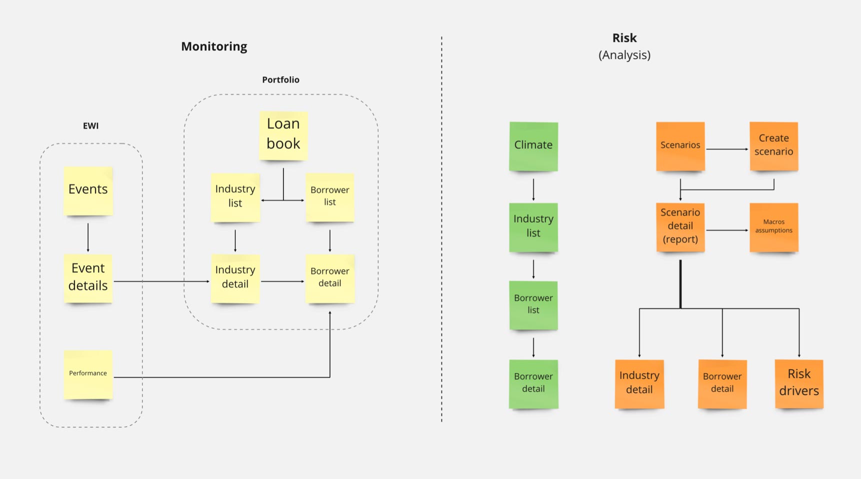
Shared information architecture

Connecting the architecture so borrowers are categorised by NAICS industry is crucial. Our modelling engine channels its algorithms through a NAICS structure, and most banks are already familiar with NAICS. The original idea is for borrower, industry, and sector pages to be accessible in a top-down and bottom-up hierarchy across all three apps. It sounds like a great idea, but in reality it is impossible to keep all three apps fully synchronised because each app cannot guarantee complete coverage of a bank’s loan book, especially in the early stages. Full coverage is expected to come later. Although the apps now share the same design language and components, they still feel and behave like one connected system. The design architecture adapts to separate the apps within a wrapper interface, while still allowing users to move between the three applications through a side menu.

NAICS industry system

Leveraging research as part of the design process

Working as lead product designer, I spoke to specialists from dozens of banks, from relationship managers to portfolio managers, from underwriters to chief risk officers, to C-Suite users, we carefully took note of each users responsibilities and took that into account in the design process so that we knew which features were applicable to each role.

One of the major challenges we faced, which we overcame through research, was understanding how banks perceive borrower risk and the steps they take to mitigate. In order to design these applications it was necessary to understand all the steps in a borrower’s lifecycle. Providing the right metrics and data came about through rigorous testing and discussions with SME’s to arrive at a design that is ‘industry standard’ in its presentation. Another challenge, which kind of follows on from the first challenge, was which industry system to leverage – we opted for the NAICS system due to its universal adoption amongst our target audience. We built the apps so that users could navigate top-to-bottom through industries seamlessly.

User testing results

ON Scenarios

Lets say Borrower A has taken out a $10m loan from the bank. As this loan is heavily invested into real estate our apps can determine if the borrower has enough financial resource to continue paying down that loan NOW, or in the next 12, 24 or even 36 months, considering that interest rates have doubled in the last 2 years, and may continue to rise, we’ll model a rise, and considering many other macroeconomic factors like decrease in GDP, increase in fuel costs, supply chain issues, unemployment and at least 20 other major factors, we’ll model those changes too.

As an OakNorth Scenarios user I want:

  • To expose industry and borrower risks in my portfolio.
  • To be able to understand future risks based on accurate assumption models.
  • Be equipped with data for market risks: Covid, War in Ukraine, Inflation etc.
  • TStress test my portfolio borrowers and industries/sectors
  • To adjust my assumption model macroeconomic factors (GDP, interest rates etc).
Design for 'Create a scaenario'

.

Screen design

Data viz whizzy-whizz

In data-heavy platforms like the ON suite of risk products, data visualisation is critical because it transforms complexity into clarity. Without strong visualisation, users are forced to interpret large volumes of raw information manually, which increases cognitive load, slows decision-making, and raises the likelihood of error. At scale, visualisation is less about “making data look good” and more about enabling faster comprehension, pattern recognition, and confident action.

A well-designed data visualisation layer helps users:

  • Identify trends and anomalies quickly.
  • Understand relationships between datasets.
  • Prioritise attention in complex environments.
  • Reduce time-to-insight.
  • Make higher-confidence decisions under pressure.
Data visualisation

ON Monitoring - the final piece

The ultimate in providing banks with an early warning system on borrower, industry or sector level that can allow risk officers to mitigate potential risks in real time, as opposed to 1 year after it happened which is so often the case.

As an OakNorth Monitoring user I want:

  • Early warnings when my borrower has breached bank policy.
  • One source of truth (I currently access 6 different systems).
  • Efficiency gains from annual reviews - you tell me the problems.
  • I want wider peer groups that extend beyond my limited portfolio.
  • I want real-time financial data and make decisions on that data.
Borrower Monitoring

With success comes a strategy blueprint

With the help of a dedicate user researcher we committed to around 9 phases of user testing, each phase ranged from 3-8 users. Each phase was aimed at a specific milestone, whether it was initial discovery (phase 1) or something further down the line after 8 or 9 phases (Peers Analysis). Learnings were captured in Miro, dissected forensically, and reiterations were made and then further tested.

Product Strategy
Next case study
Preqin Pro — Digital Transformation
FintechAIEnterprise2020

Preqin Pro — Digital Transformation

Preqin's flagship data platform serves 90,000+ professionals across private equity, hedge funds, and real assets. As a contracted lead designer, I lead feature teams in the Digital Transformation of this giant replatforming project — moving from a dated interface to a modern, research-driven platform that surfaced data with clarity and speed.

Client
Preqin · The world's leading alternative assets data platform.
Duration
2 contracts over 21 months
My role
Lead UX/UI Designer
Team size
8 UX and UI designers across 3 teams
Preqin Pro

Transforming Private Capital Intelligence Through Product Design

In 2018, I joined Preqin to help shape the next generation of products for the private capital industry. My focus was leading UX and product design across what became Preqin Pro — a modern data intelligence platform designed to help investors, analysts, and fund managers navigate one of the world’s most complex financial datasets with greater speed, clarity, and confidence. Preqin Pro sat behind a subscription model and connected directly into one of the industry’s largest private capital datasets. The challenge wasn’t simply visualising data — it was transforming a fragmented legacy ecosystem into a scalable, user-centred platform capable of supporting sophisticated investment workflows. Across two consultancy engagements, I worked across multiple initiatives within the wider Preqin product ecosystem, including:

  • Preqin Pro
  • The redesign of preqin.com
  • A new client-facing Data Contribution platform
  • Machine learning and research tooling for internal analyst teams
  • Cross-product design systems and UI governance

The work combined product strategy, UX leadership, service design, systems thinking, and hands-on interaction design within a fast-moving fintech environment.

Customer dashboard

"In a market defined by rapid change, Preqin helps us see the landscape clearly and respond quickly – bringing the right capital and insights to our clients when it matters."

— Customer success story

Replatforming a Legacy Enterprise Ecosystem

Preqin’s original platform had evolved over many years alongside the company’s rapid growth. While the underlying data offering was highly valuable, the user experience had become increasingly fragmented and difficult to scale.

Users frequently struggled with:

  • Inconsistent navigation and information architecture
  • Duplicated entity records across asset classes
  • Slow and inefficient workflows
  • Difficulty locating performance and benchmarking data
  • Disconnected search experiences
  • Complex, multi-step journeys for common tasks
Replatforming a behemoth

One of the most critical structural problems was the way entities were modelled across the platform. Firms were separated into siloed asset-class views — meaning a single organisation could appear multiple times depending on context. Users searching for a company such as BlackRock might encounter numerous disconnected profiles, each containing only partial information.

This created significant friction for investment professionals who needed a unified view of firms, funds, performance, and relationships.

The redesign effort became much more than a UI refresh — it was fundamentally a product and data architecture transformation.

Defining a User-Centred Product Vision

The team took a greenfield approach to rethinking the platform experience from the ground up.

Working closely with product managers, stakeholders, developers, researchers, and other designers, we established a product vision centred around:

  • Unified entity modelling
  • Faster access to critical investment data
  • Reduced cognitive load
  • Flexible research workflows
  • Scalable information architecture
  • Modern visualisation and benchmarking tools

A key innovation was the move toward a single-profile entity model, enabling users to access all relevant information about a firm in one place regardless of asset class or sector. This significantly improved discoverability, reduced duplication, and aligned the platform more closely with how investment professionals actually think and work.

Workshops and rapid prototyping

Discovery, Workshops & Rapid Prototyping

The early discovery phase was highly collaborative and workshop-driven. Over several months, the design team worked closely with stakeholders across research, engineering, and commercial functions to map workflows, define product epics, and validate assumptions.

The initial platform vision focused on five core product areas:

  • Dashboard and market overview experiences
  • Global search and discovery
  • Advanced list building and screening
  • Entity profile experiences
  • Data visualisation and benchmarking
Rapid prototyping Rapid prototyping Single entity profile Charts visualisation

As part of a multi-disciplinary UX/UI team, I primarily led design across dashboards, profile architecture, and data visualisation experiences, while also contributing to wider platform improvements throughout delivery.

The work involved:

  • User journey mapping
  • Information architecture design
  • Workflow modelling
  • Wireframing and prototyping
  • Stakeholder alignment sessions
  • Design-to-development collaboration
  • Iterative usability testing

Given the complexity of the data and workflows, prototyping became essential to validating concepts early and reducing delivery risk before engineering implementation.

Leading Through User Insight & Accessibility

One of the major themes throughout the project was balancing visual sophistication with usability and accessibility.

Early high-fidelity concepts explored a dark-themed interface designed to position the product as premium and data-rich. However, usability testing quickly revealed a mismatch between aesthetic ambition and real-world usage patterns.

Users spending long periods analysing dense financial datasets reported:

  • Eye strain during extended sessions
  • Reduced readability of smaller data points
  • Difficulty scanning complex tables and charts
  • Navigation fatigue within deep workflows

The research reinforced the importance of designing for sustained professional usage rather than visual novelty.

Based on these findings, we pivoted toward a lighter, more accessible interface system with improved hierarchy, contrast, and readability. We also simplified navigation patterns, clarified distinctions between search modes, and improved filtering behaviours across the platform.

This iterative process helped establish a stronger culture of evidence-based product decision making across the team.

Iterative design

Launching MVP & Establishing Continuous Product Improvement

The first internal MVP launched in 2018, followed by an extended optimisation and stabilisation phase before public release in 2019.

Rather than treating launch as the finish line, the product evolved into a continuous improvement programme driven by:

  • User feedback loops
  • Analytics and behavioural insight
  • Ongoing usability testing
  • Feature refinement
  • Navigation optimisation
  • Performance improvements

This shift toward iterative product development represented a major cultural evolution from the legacy platform approach.

MVP snippet

Designing Research & Machine Learning Tools

Following the successful rollout of Preqin Pro, I worked with the Research division on additional products designed to support both internal analysts and external contributors.

This included

Machine Learning Research Platform

A new tool enabling research teams to analyse and enrich large datasets using machine learning-assisted workflows.

Data contribution flow

Data Contribution Platform

A redesigned experience allowing clients and internal users to submit data directly into Preqin’s ecosystem more efficiently and accurately. The legacy contribution process was slow, highly manual, and deeply tied to ageing internal systems. Users often spent hours submitting returns, AUM updates, fund information, and historical performance data.

The redesign focused on:

  • Reducing submission time
  • Simplifying complex workflows
  • Improving data validation feedback
  • Increasing transparency and trust
  • Creating clearer communication between contributors and research teams
  • Streamlining operational efficiency

The result was a much more modern, task-oriented experience designed around progressive disclosure and user intent rather than legacy system constraints.

Contribute Data System

Building design systems at scale

One of the most impactful aspects of my second engagement at Preqin was helping establish a shared design system and reusable component library across the wider product ecosystem.

As the platform portfolio expanded, consistency and scalability became increasingly important.

The design system enabled teams to:

  • Create greater UI consistency across products
  • Accelerate design and engineering workflows
  • Improve accessibility standards
  • Reduce duplicated effort
  • Support faster prototyping and delivery
  • Establish a shared product language across teams

This foundation helped mature design operations within the organisation and supported a more scalable product development culture moving forward. Seen here is an example of the design system applied to the corporate website

Outcome

The work at Preqin helped transition a legacy financial data platform into a more modern, scalable, and user-centred product ecosystem. More importantly, it demonstrated how strategic UX and product design can play a critical role in simplifying complex financial workflows, improving decision-making, and enabling organisations to evolve legacy enterprise systems into modern digital products.

Next case study
AI-Powered Campaign Automation Platform
EcommerceAIEnterprise2026

AI-Powered Campaign Automation Platform

BT had an idea which they asked Jellyfish to prove. Jellyfish came to me and asked me to create some prototypes to prove their hypothesis. I did this successfully and the result was that the project was built. I explain how this was possible through a defined iterative design strategy, rigorous user testing and user feedback loops.

Client
Jellyfish · BT
Duration
6 months
My role
Lead/Principle UX/UI Designer
Team size
1 team, 3 devs, 3 designers

Overview

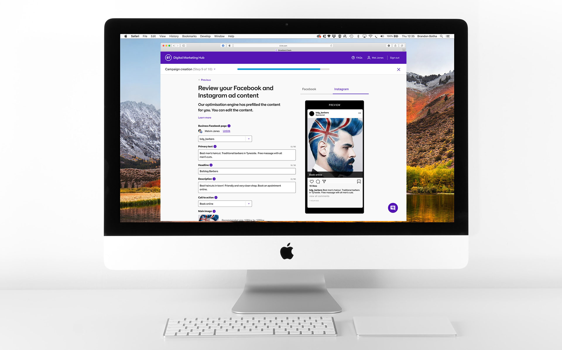
Jellyfish partnered with a major UK telecommunications provider to explore a new AI-powered product designed to support small businesses during the Covid-19 pandemic. The goal was to simplify digital advertising for SMEs by reducing the complexity of managing multi-channel campaigns across platforms such as Facebook, Instagram and LinkedIn.

As Lead Product Designer, I was responsible for shaping the product vision from early discovery through to validated prototype. This included defining user journeys, leading UX strategy, facilitating workshops, directing UI execution, and validating the proposition through iterative testing.

The outcome was a scalable campaign management platform that enabled non-technical users to launch, manage and optimise cross-channel advertising campaigns in minutes.

"We need to help small businesses get back up off the ground after being hit by Covid"

— CPO, project kick-off

The idea

Small businesses relied heavily on social platforms to generate awareness and sales, yet the tooling available across advertising ecosystems was fragmented, overly technical and difficult to navigate without specialist knowledge.

The client identified an opportunity to create a unified platform that could:

  • Simplify campaign creation across multiple advertising channels
  • Reduce barriers for non-technical business owners
  • Use AI to automate optimisation and performance analysis
  • Deliver a more accessible, self-serve marketing experience

At the outset, the product existed purely as a hypothesis. Our challenge was to validate whether the concept solved a genuine user need and whether businesses would trust an AI-assisted workflow to manage paid advertising.

Hypothesis

My role

As Lead UX/UI Product Designer, I led the end-to-end design process across discovery, service design, UX strategy and interface design.

Responsibilities included:

  • Leading product discovery workshops with stakeholders and product teams
  • Defining user journeys and service flows
  • Translating business requirements into validated product concepts
  • Creating low and high-fidelity prototypes in Figma
  • Planning and moderating usability testing sessions
  • Synthesising research insights into prioritised product improvements
  • Establishing scalable UI patterns using BT component libraries
  • Collaborating closely with developers, UX researchers and product stakeholders throughout delivery
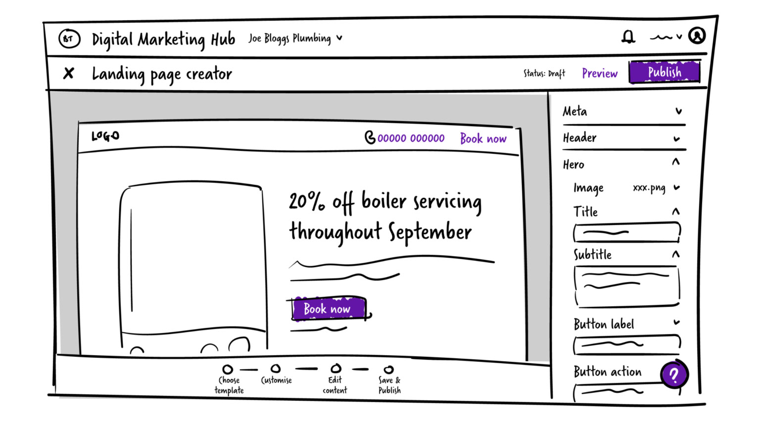
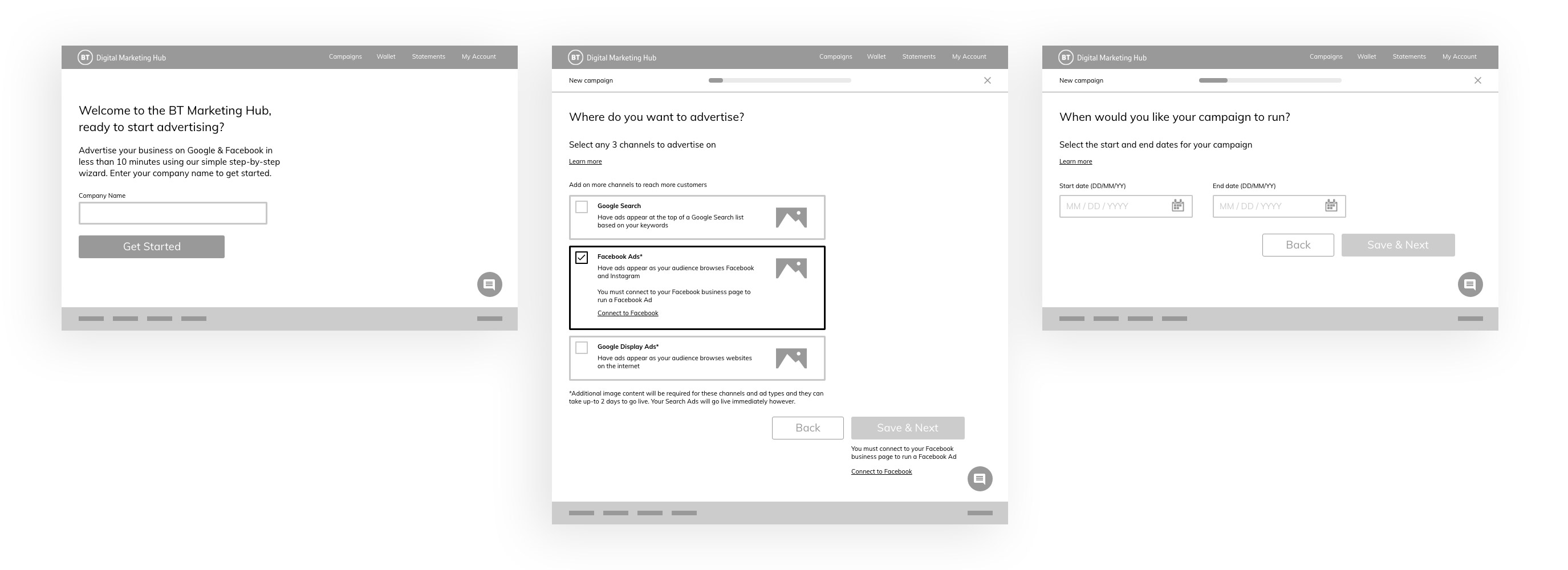
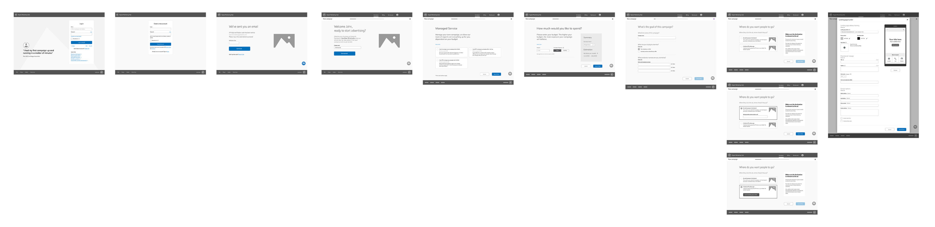
Early high level journeys

.

Early high level journeys

.

Early high level journeys

Discovery & Product Strategy

We began by mapping the full campaign creation lifecycle and identifying key friction points across existing advertising tools.

Research revealed several consistent challenges:

  • Users found advertising platforms intimidating and overly complex
  • Campaign setup processes were fragmented across multiple systems
  • Reporting metrics varied significantly between channels
  • Small businesses lacked confidence interpreting campaign performance data

To validate assumptions early, we created lightweight journey maps, rapid wireframes and clickable prototypes that allowed us to test core workflows before committing to detailed UI execution.

This iterative approach helped align stakeholders quickly while reducing delivery risk.

Campaign creation journey Campaign creation journey

Designing an AI-Assisted Experience

A core part of the product proposition was the integration of AI-driven campaign support.

The platform was designed to help users:

  • Generate campaigns across multiple channels from a single workflow
  • Receive automated recommendations and performance insights
  • Analyse campaign effectiveness in real time
  • Optimise spend and targeting with minimal manual intervention
AI integration

One of the most complex UX challenges involved normalising campaign reporting data across different advertising ecosystems.

Metrics such as CPC, ROI, conversions and engagement varied significantly depending on campaign objectives and platform-specific structures. We worked closely with stakeholders and researchers to develop a consistent reporting framework that simplified decision-making without oversimplifying the data.

This resulted in a more coherent analytics experience that made campaign performance accessible to non-expert users.

User Testing & Iteration

Validation was central to the product process. Over the course of the project, we conducted more than 80 moderated usability testing sessions with a combination of external participants and internal operational teams.

Each round of testing focused on evaluating:

  • Campaign setup flows
  • Navigation clarity
  • Understanding of AI recommendations
  • Reporting and analytics comprehension
  • Cross-channel workflow usability

Insights were prioritised and fed directly into agile design sprints, allowing the product to evolve rapidly through continuous iteration.

This process helped de-risk the product significantly before development began and ensured the final experience was grounded in real user behaviour rather than stakeholder assumptions.

Responsive design

Design Systems & Scalability

Following validation of the core journeys, we transitioned the product into a scalable UI framework using BT’s existing design system and component libraries.

This enabled:

  • Faster iteration across teams
  • Improved visual consistency
  • Greater accessibility alignment
  • More efficient developer handoff
  • Scalable patterns for future product growth

The final output balanced speed, usability and enterprise-level scalability while remaining approachable for less digitally mature users.

Components and design system in action

Outcome

The project successfully validated the product hypothesis and established a strong foundation for development.

Key outcomes included:

  • A validated AI-assisted campaign management proposition
  • End-to-end responsive product journeys
  • A scalable component-driven UI framework
  • Extensive usability validation across multiple user groups
  • A simplified advertising workflow for non-technical SMEs
  • Alignment between business goals, user needs and technical feasibility

The project ultimately progressed into development following stakeholder approval and successful concept validation.

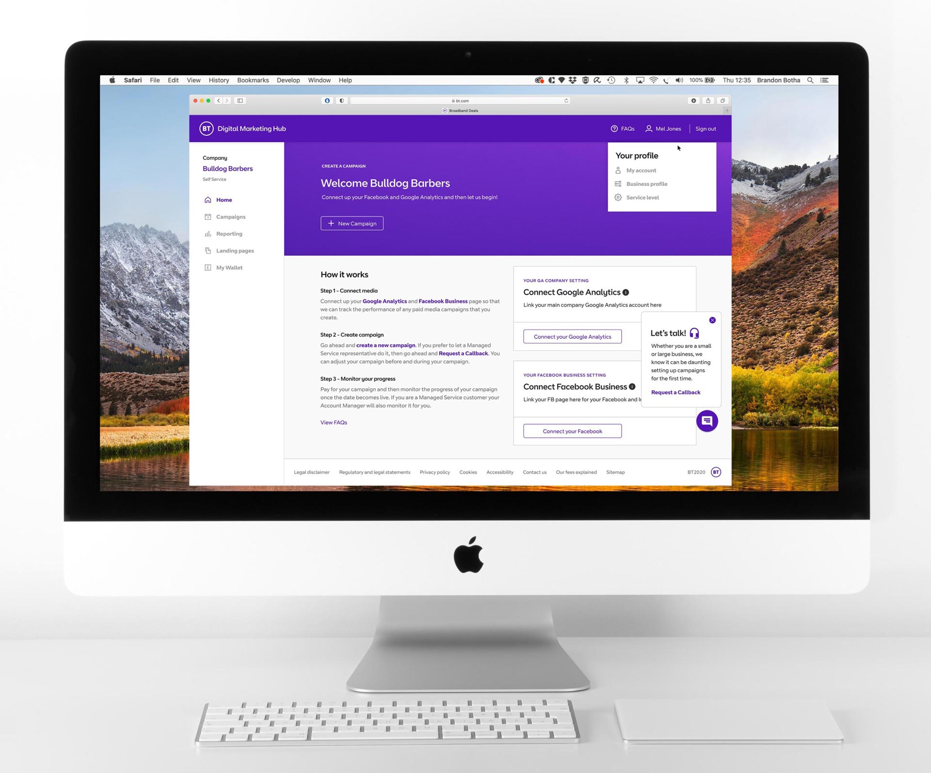
Dashboard

Reflection

This project highlighted the importance of balancing innovation with usability — particularly when designing AI-assisted experiences for non-expert audiences.

Beyond interface design, the role required strategic thinking across product definition, systems design, stakeholder alignment, research synthesis and scalable UX delivery.

It reinforced the value of rapid validation, collaborative product thinking and designing complex systems in ways that feel intuitive, trustworthy and accessible.

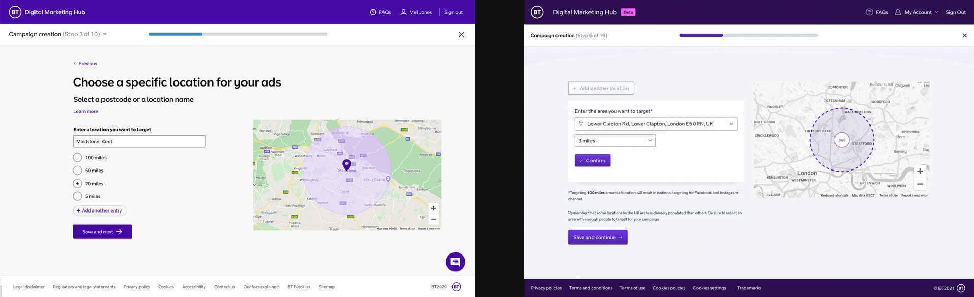
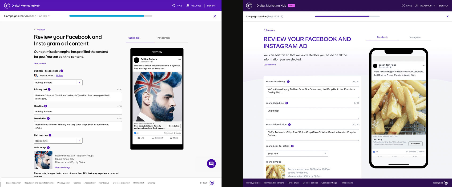
Below you can see how the initial designs I handed off were about as close as you get to being dev ready. This was due to a combination of design skill and effective use of component libraries and design styling.

Prototype vs build comparison Prototype vs build comparison Prototype vs build comparison
Next case study
Vanquis Bank — Redesigning a High-Volume Banking Experience
BankingFintechApp2017

Vanquis Bank — Redesigning a High-Volume Banking Experience

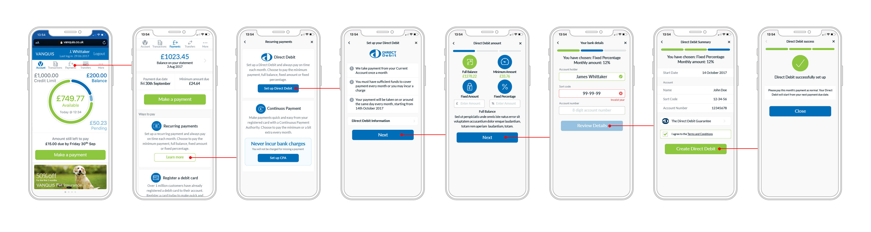
Joining the project at Chelsea Apps to redefine the Vanquis Bank commercial banking app and online bank as lead UX, as well as working across UI design. Over the course of the next 6 months we transformed the existing 2.4 star rated app into a 4.8 star app, launching the new product in November 2017, subsequently winning Best Fintech App at the UK App Awards 2018. I discuss the route to creating a 5-star app.

Client
Chelsea Apps · Vanquis
Duration
6 months
My role
Lead/Principle UX/UI Designer
Team size
2 team, 12 devs, 2 designers
Vanquis

Overview

In 2017, I joined the team at Chelsea Apps as Lead UX/UI Designer to redesign the digital experience for Vanquis Bank across both mobile app and web platforms.

The existing product suffered from significant usability and accessibility issues, resulting in poor customer sentiment and a mobile app rating of just 2.4 stars. Over a six-month engagement, we transformed the experience into a modern, accessible and user-centred banking platform, increasing the app rating to 4.8 stars and helping the product win Best Fintech App at the UK App Awards 2018.

The project combined product strategy, UX research, accessibility design, rapid prototyping and continuous user testing within a fast-paced agile delivery environment.

"Design is not just what it looks like and feels like. Design is how it works."

— Steve Jobs
Vanquis

The challenge

Vanquis needed to modernise a digital banking experience that had evolved without a clear UX strategy or cohesive design system.

Key issues included:

  • Poor accessibility and readability
  • Inconsistent UI patterns and visual language
  • Low customer trust and usability frustration
  • Fragmented experiences between app and web
  • Lack of scalable design standards
  • Minimal evidence of user-centred design practices

The challenge extended beyond visual redesign. The objective was to rebuild confidence in the product by creating a simpler, more accessible and more intuitive banking experience for a highly diverse customer base.

Analysing the problems

My role

As Lead UX/UI Designer, I led the redesign effort across discovery, UX strategy, interaction design and UI system development.

Responsibilities included:

  • Auditing the existing digital experience
  • Defining UX strategy and usability priorities
  • Leading product workshops with agency and client stakeholders
  • Creating wireframes, user flows and high-fidelity prototypes
  • Conducting and moderating usability testing sessions
  • Establishing accessibility-first UI principles
  • Developing a modular design system
  • Collaborating closely with developers, stakeholders and researchers across agile delivery cycles

I worked across both agency and client environments, balancing agile product delivery with more traditional enterprise stakeholder processes.

Early high level journeys

Product Audit & UX Analysis

During the initial discovery phase, I conducted a full UX review of the existing app and website experience.

The audit revealed multiple systemic usability issues:

  • Typography lacked hierarchy and readability
  • Interactive elements failed accessibility standards
  • Navigation patterns were inconsistent
  • Visual clutter reduced clarity and confidence
  • Critical journeys required unnecessary cognitive effort

It became clear that the experience had been built incrementally without a cohesive design foundation or accessibility considerations.

Rather than applying superficial visual improvements, we approached the redesign as a ground-up product rethink focused on usability, clarity and trust.

User journey Animated sequence

Building an Accessibility-First Design System

One of the most important insights emerged during early research and testing sessions: the user base spanned a wide demographic range, including many customers with accessibility needs.

This fundamentally shaped the product direction.

We introduced a new design language inspired by iOS Human Interface principles, prioritising:

  • Larger, more legible typography
  • Stronger contrast and visual hierarchy
  • Simpler layouts and interaction patterns
  • More accessible button sizing and touch targets
  • Reduced visual noise and decorative clutter
  • Consistent spacing and component behaviour

To support scalability, I helped establish a modular UI framework built around a 6px spacing system and reusable component patterns.

This created consistency across both app and web experiences while improving collaboration between design and development teams.

Grid system

Lean UX & Continuous Validation

The project followed a highly iterative Lean UX approach centred around rapid prototyping and continuous user validation.

Working in agile sprint cycles, we designed, prototyped and tested features continuously throughout the engagement.

Rather than relying on static wireframes alone, we created interactive high-fidelity prototypes in Marvel that allowed users to experience realistic product flows before development.

Usability testing sessions were conducted fortnightly using real Vanquis customers recruited directly by the client.

Each session generated actionable insights that were immediately fed back into the product backlog and prioritised within upcoming sprints.

This iterative process significantly reduced delivery risk while ensuring design decisions remained grounded in real customer behaviour.

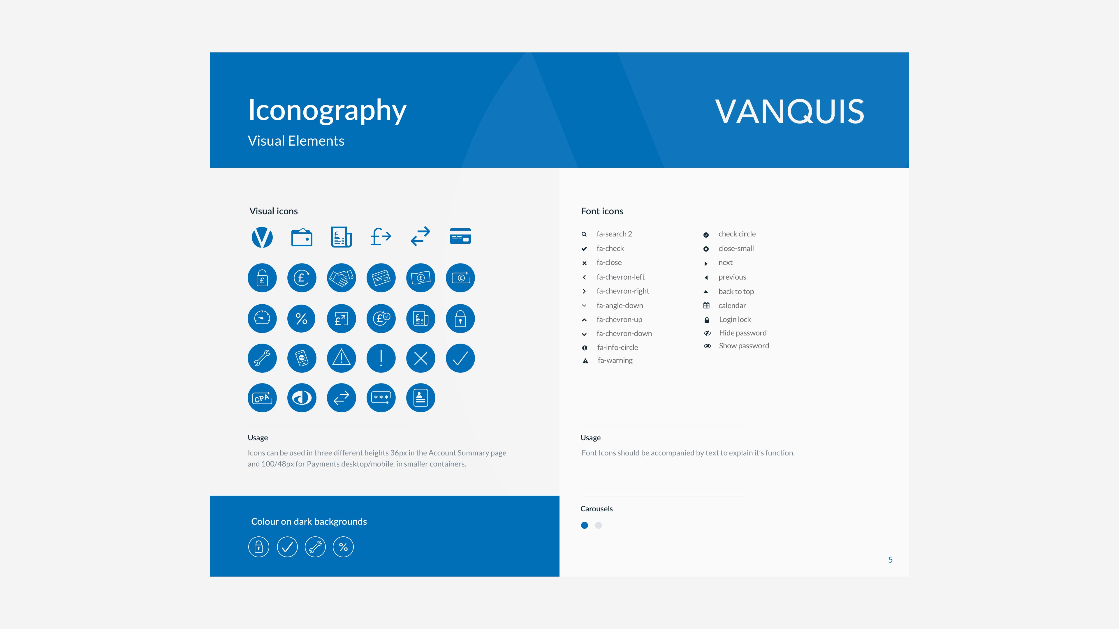
Style guide

Designing for Real Users

One of the defining aspects of the project was the depth of accessibility research and behavioural insight gathered during testing.

A particularly impactful session involved a visually impaired participant demonstrating how he navigated digital products using assistive technology and reading tools.

Sessions like these fundamentally influenced design decisions and reinforced the importance of inclusive product thinking.

Over time, repeated testing helped align the app and website into a single, unified experience. Eventually, users began commenting that they could no longer distinguish between the two platforms — a strong signal that the ecosystem had achieved consistency and coherence.

user testing session

Cross-Functional Collaboration

The project required close collaboration across both agency and enterprise environments. I worked regularly with stakeholders at Vanquis Bank’s offices in Chatham while also collaborating with multidisciplinary teams at Chelsea Apps.

This meant balancing two very different operational models:

  • Agile product delivery within the agency
  • More traditional waterfall planning structures within the client organisation

A key part of the role involved bridging these working styles, aligning stakeholders and maintaining momentum across research, design and delivery.

Dashboard

Outcome

The redesign delivered measurable improvements across usability, accessibility and customer satisfaction.

Key outcomes included:

  • App Store rating increased from 2.4 to 4.8 stars
  • Winner of Best Fintech App at the UK App Awards 2018
  • Unified web and mobile banking experience
  • Accessibility-first design framework
  • Modular design system for scalable delivery
  • Continuous user validation embedded into product development
  • Improved usability and customer confidence across key journeys
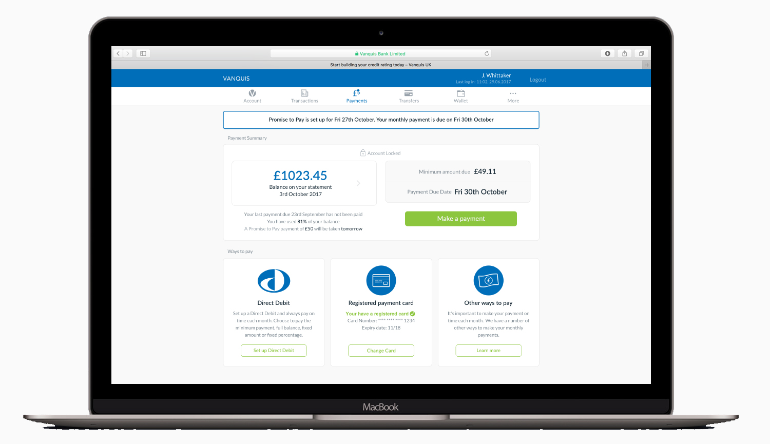
Payment card

Reflection

This project reinforced the value of continuous user feedback as a core product design practice rather than a one-off validation step.

The success of the redesign was not driven by visual polish alone, but by consistent iteration, accessibility thinking and deep collaboration between users, stakeholders and delivery teams.

It also highlighted how strong UX leadership can transform not only interfaces, but the way organisations think about product development, customer needs and long-term digital strategy.

Online bank
Next case study
Building scalable design systems
BankingFintechEnterpise2020

Designing scalable Design Systems in Figma

A good design system is essential for building products quickly and effectively by product design teams. A Design System is critical in larger design teams and can reduce testing time, eliminate design divergence and speed up production time. It also allows design teams to rely less on wireframes and work with higher fidelity screens, speeding up the iteration process.

Client
HCL · Deutsche Bank
Duration
6 months
My role
Lead/Principle UX/UI Designer
Team size
1 team, 6 devs, 5 designers
DB

Overview

A mature design system is a foundational capability for scaling product development across multidisciplinary teams. It enables organisations to reduce inconsistency, accelerate delivery, and improve collaboration between design and engineering.

At a systems level, it shifts teams away from ad-hoc, screen-by-screen design towards a component-led approach, where high-fidelity, production-aligned interfaces are composed from shared, governed building blocks. This reduces ambiguity, shortens feedback loops, and improves design-to-development fidelity.

In Figma, this is operationalised through a centralised library of tokens, styles, and components—structured to support reuse, extensibility, and long-term maintainability.

“A design system acts as the connective tissue that holds together your entire platform.”

— Drew Bridewell, Invision
Intro to design systems

Establishing the system

During a contract with HCL Technologies, I led the definition and rollout of a new design system library for the Corporate Banking design team. The objective was to create a single, scalable source of truth that could support multiple product streams and ensure consistency across a complex banking domain.

The work involved deconstructing existing validated interfaces into a structured system of reusable components and styles, aligned to a strict set of design principles and an approved visual language.

Rather than treating this as a one-off deliverable, the system was designed as an evolving product in itself—continuously refined through collaboration with designers, validated through real-world usage, and iterated as new patterns emerged.

Using Figma’s shared libraries and publishing model, updates could be distributed instantly across teams, ensuring adoption without introducing version fragmentation.

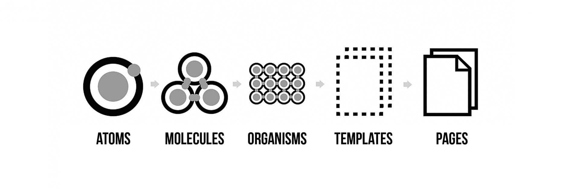
Atomic principles

System philosophy and structure

While methodologies such as Atomic Design provide useful conceptual framing, in practice they can introduce unnecessary abstraction and cognitive overhead for teams operating at scale. A more effective approach is to optimise for usability, clarity, and adoption, rather than taxonomy for its own sake.

The system was therefore structured around three practical layers:

  • Design tokens (colour, type, spacing, elevation)
  • Core components (inputs, buttons, navigation, cards)
  • Composed patterns (reusable UI assemblies used across journeys)

This model prioritises how designers actually work—reducing friction while still supporting scalability and governance.

Design tokens

Foundational system principles

Colour as a system primitive

Colour forms a critical layer of system governance. In this implementation, all visual elements were bound to a structured token system supporting both light and dark themes.

Centralising colour through Figma styles ensured that updates could be made safely at scale, with changes propagating instantly across all dependent components and products. This significantly reduced inconsistency risk in a large, multi-team environment.

Colour tokens

Stroke, fill, and visual hierarchy

Stroke and fill styles were intentionally decoupled to allow for more precise control of visual hierarchy, particularly in dark mode contexts where perceptual contrast can degrade clarity.

Rather than relying purely on algorithmic colour derivation, decisions were validated through visual calibration against real interface contexts—ensuring accessibility, legibility, and hierarchy integrity across environments.

Strokes and fills

Naming and system taxonomy

A scalable design system depends heavily on consistent, predictable naming conventions that align design, development, and product language.

The naming structure was designed to reflect how teams think about products rather than abstract system theory, ensuring discoverability and reducing cognitive load.

Example structure:

  • Acme Design System / Light / Button / Primary
  • Acme Design System / Light / Typography / Body / Secondary
  • Acme Design System / Light / Colour / Surface / Elevated

This approach ensured parity between Figma, development components, and documentation layers, improving cross-functional alignment.

Spacing tokens

Component architecture

Each component was designed as a composable system rather than a static asset.

For example, a button component is composed of:

  • Design token-driven fill and stroke styles
  • Typography styles for labels
  • Icon components where required
  • Variant logic for state and hierarchy

This approach ensures that updates are applied at the system level rather than at the instance level, significantly improving maintainability at scale.

A key principle was strict separation of concerns—avoiding over-styling components and ensuring each layer remains independently governable.

Strokes and fills

Grid and spacing system

Spacing is one of the most important determinants of visual consistency and usability in interface design.

The system was built on an 8pt grid foundation, with 4pt increments used selectively where finer control was required.

This approach provides:

  • Predictable spatial rhythm across interfaces
  • Stronger visual hierarchy and readability
  • Reduced decision-making overhead for designers
  • Scalable consistency across responsive layouts

At scale, spacing systems become a critical enabler of design velocity and coherence across teams.

Storybook

From design to implementation (Figma → Storybook)

A design system only delivers value when tightly integrated into the development lifecycle.

The implementation strategy prioritised early alignment between design and engineering, embedding the component library into development workflows from the outset rather than retrofitting after UI completion.

In practice:

  • Components were designed and maintained in Figma as the source of truth
  • Design artefacts were translated into coded components
  • Storybook (and similar tooling such as Widgetbook) was used as a live documentation layer

This created a shared system of record between design and engineering, enabling real-time validation, reducing ambiguity, and improving release confidence.

Next case study
PlayStation Partners enterpise platform
EcommerceFintech2017

PlayStation Partners

Start to finish UX product design of this global platform — a large-scale enterprise product.

Client
Portaltech · Sony PlayStation
Duration
13 months
My role
Senior UX/UI Designer
Team size
3 teams, 20 devs, 6 designers
PlayStation Partners

Global Game Developers Platform

As a contracted Senior UX/UI Designer for Portaltech, I worked on the greenfield project PlayStation Partners platform — a large-scale enterprise product used by game developers and publishers to self-publish content across the PlayStation ecosystem worldwide. The platform acted as a centralised hub where developers could upload game builds, manage regional assets, submit marketing collateral, and distribute content across the PlayStation Network for Europe, North America, Japan, and Asia.

The project represented a major strategic milestone for Sony PlayStation, consolidating four previously disconnected regional systems into a single unified global platform. It was also a technically and organisationally complex programme that had previously failed in both the US and Japan, making successful delivery a significant achievement for the wider team.

Working as part of a joint collaboration between Portaltech, Accenture, and Sony PlayStation, I operated within a large agile product team made up of UX designers, UI designers, front-end developers, back-end engineers, business analysts, and technical leads. Much of the project was delivered onsite at Sony PlayStation’s London headquarters on Oxford Street, enabling close day-to-day collaboration with stakeholders and product owners throughout discovery and delivery.

High level journey mapping

My role

My role focused on leading UX across several major release workstreams, owning the design of complex release-based workflows and developer journeys across multiple work packages. The platform itself was highly operational and data-heavy, requiring developers to manage large volumes of digital assets, metadata, localisation requirements, compliance information, and region-specific publishing rules. A core challenge was simplifying these complex workflows into intuitive, scalable user journeys that could support both experienced publishers and smaller independent studios.

During the initial discovery phase, I facilitated workshops, mapped user journeys, and rapidly prototyped concepts to validate workflows with stakeholders and external PlayStation Partners. Working closely with business analysts and engineering teams, I translated technical requirements into wireframes, interactive flows, and high-fidelity prototypes. Extensive usability testing was conducted with external partners through Foolproof, helping us validate assumptions and refine the experience through continuous iteration.

Early wireframing

One of the key successes of the project was establishing scalable UX patterns for highly complex publishing and release-management tasks. I designed workflows that balanced flexibility with clarity, using familiar interaction patterns and progressive disclosure to reduce cognitive load across large operational journeys. This helped simplify tasks such as regional asset management, localisation handling, and multi-market publishing approvals.

Following the UX discovery phase, I moved into visual design and prototyping, creating high-fidelity interfaces using Sketch and InVision, while working within an evolving design system to ensure consistency across the platform. I also collaborated closely with front-end developers to support design implementation and ensure fidelity between design and production.

Early woreframes

Enterprise scale

The project introduced me to new collaborative workflows and tooling at enterprise scale, including extensive use of OmniGraffle for rapid journey mapping and workflow visualisation. In a highly workshop-driven environment, OmniGraffle proved particularly effective for quickly iterating on large, interconnected user flows without the overhead of more interaction-heavy prototyping tools. This allowed the UX team to work fluidly with stakeholders in real time while maintaining momentum across discovery sessions.

Over the course of the engagement, I became a key UX contact for multiple release streams, helping coordinate design delivery across stakeholders, developers, and product teams while maintaining alignment with business objectives and technical constraints. Working so closely with Sony stakeholders onsite provided invaluable exposure to enterprise-scale product development and reinforced the importance of collaboration, adaptability, and iterative design within complex global programmes.

Style guide Style guide Style guide

The final platform successfully unified PlayStation’s regional developer ecosystems into a single scalable solution, improving operational efficiency for both Sony and its publishing partners while creating a far more streamlined and consistent developer experience globally.

Style guide Style guide

The final platform successfully unified PlayStation’s regional developer ecosystems into a single scalable solution, improving operational efficiency for both Sony and its publishing partners while creating a far more streamlined and consistent developer experience globally.

“ The quality of work from Brandon is impressive, especially as he produces it quicker than most. Where others might be happy with a superficial overview he works hard to understand the context of what he is designing. This approach, his UX knowledge and an innate creativity produces wireframes that really work for his clients.”

— SONY PLAYSTATION
Next case study
JSOX compliant payment system for NCP
EcommerceFintech2017

National Car Parks

Enterprise replatforming J-SOX compliant payments platform

Client
Keytree (Deloitte) · National Car Parks
Duration
3 months
My role
Lead UX/UI Designer
Team size
5
National Car Parks

Replatforming a payments system for National Car Parks

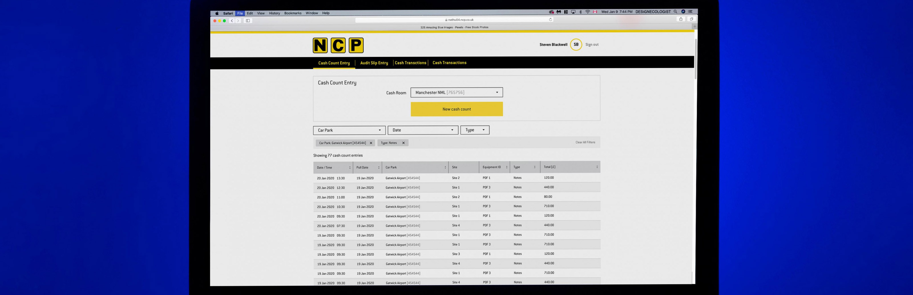
As contracted lead UX/UI designer for Keytree (Deloitte), I was responsible for leading the UX and interface design delivery for a new J-SOX compliant online payments platform for National Car Parks (NCP), working as part of the consultancy team. The project involved redesigning and rebuilding NCP’s internal payment operations system from the ground up following the company’s acquisition by a Japanese parent organisation, requiring the platform to comply with strict Japanese financial governance and auditing regulations.

Unlike a traditional replatforming initiative, this was a complete product rebuild focused on achieving full J-SOX compliance — a governance framework designed to enforce transparency, accountability, and “four-eyes” approval processes across all financial operations. The system functioned similarly to enterprise banking and financial control platforms, requiring highly structured workflows, robust auditability, and clear operational oversight.

Wireframes

My role

The platform was designed specifically for NCP operational staff managing daily financial transactions, payment reconciliation, and machine auditing across multiple car park locations. Because the application was only accessible on-site within controlled environments, the experience was optimised for fixed-width desktop displays at a minimum resolution of 1280px, allowing us to focus on dense operational workflows and data-heavy interfaces without compromising usability.

Leading the UX/UI workstream, I acted as the primary point of contact for design delivery between NCP stakeholders, the Keytree product team, and engineering. I designed and handed off production-ready interfaces using Sketch and Zeplin, ensuring all outputs aligned with NCP’s established brand guidelines while also supporting accessibility, usability, and compliance requirements.

Early wireframing

Enterprise scale

The discovery phase began through collaborative MVP workshops at the client’s London offices, where we worked closely with stakeholders to define requirements, workflows, and operational priorities. As the Covid-19 pandemic shifted teams into remote working, the project transitioned fully online, requiring close daily collaboration through virtual workshops and agile ceremonies using Microsoft Teams. I coordinated closely with both NCP’s product stakeholders and the wider Keytree delivery team to maintain alignment across UX, engineering, and business objectives.

Part of my role involved translating complex operational and compliance requirements into scalable user journeys and product workflows. After analysing the initial requirements gathered by a third-party consultancy, I mapped high-level user journeys before breaking them down into feature-level flows, Jira stories, wireframes, and interactive prototypes. From there, I evolved the concepts into development-ready UI designs and collaborated directly with engineering teams throughout implementation.

Early wireframing Early wireframing

Research

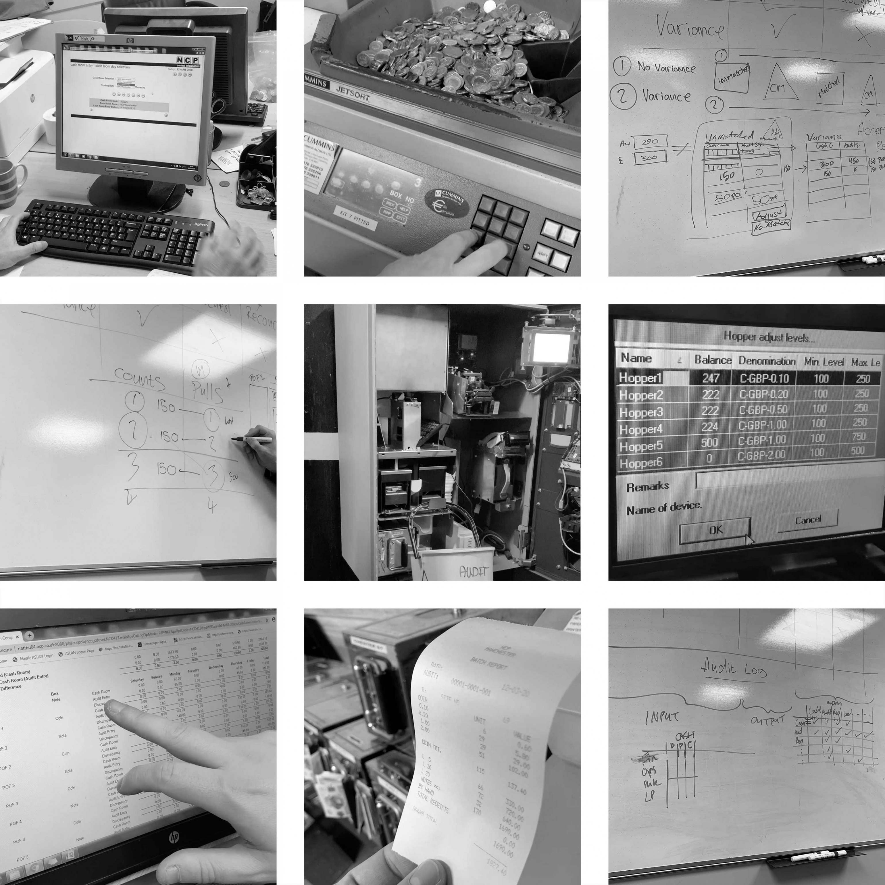
A particularly valuable part of the project involved onsite research sessions at NCP’s Manchester operations centres, where I was able to observe operational workflows firsthand, interview users, and document real-world processes. This immersion helped uncover pain points, inefficiencies, and edge cases that would have been difficult to identify through stakeholder workshops alone. By spending time directly with operational staff, I was able to design workflows that better reflected real user behaviour and environmental constraints.

User feedback became a core part of the agile delivery process. Once wireframes and prototype flows were defined, NCP facilitated walkthrough and testing sessions with operational users, allowing us to gather rapid feedback and continuously refine the experience within active sprint cycles. This iterative approach helped ensure the platform remained intuitive and efficient despite the complexity of the underlying compliance requirements.

Early wireframing Early wireframing Early wireframing Early wireframing

“I have had the pleasure of working with Brandon on a significant project for NCP where he is the lead UX Designer, and he provided the high quality UX designs that really captured the NCP requirements and journey. Brandon is very good at getting to the real need of the user and provides real insight into alternative solutions. This working approach allows him to avoid errors in subsequent stages as accurate details and measures are taken while still in the design phase.”

— Product Owner, NCP
Next case study
Replatforming a much loved national train institution
Ecommerce2017

Southwest Trains

Replatforming the Southwest Trains digital ecommerce experience

Client
Zone Agency · Southwest Trains
Duration
3 months
My role
Lead UX/UI Designer
Team size
6
Southwest Trains

My role

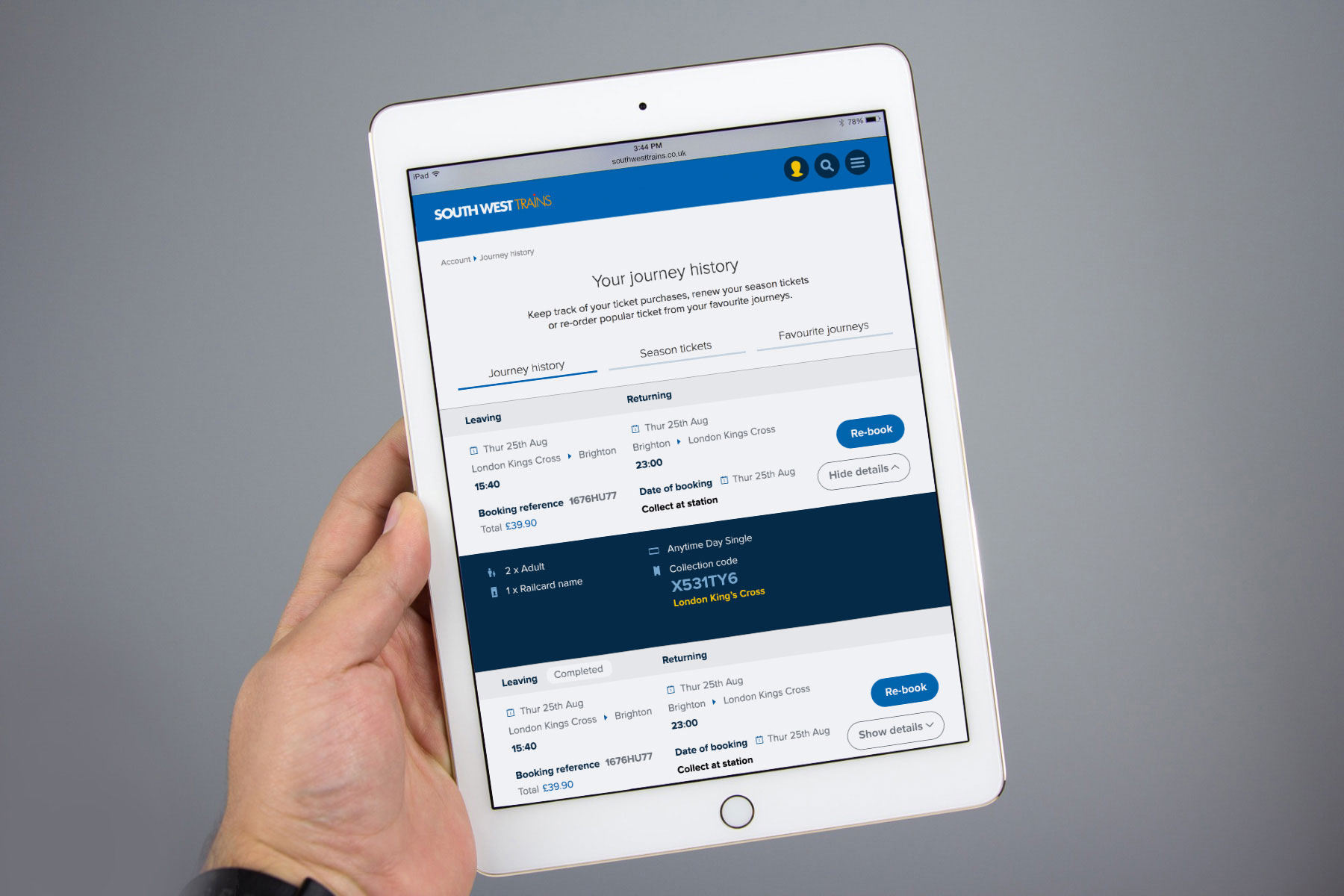
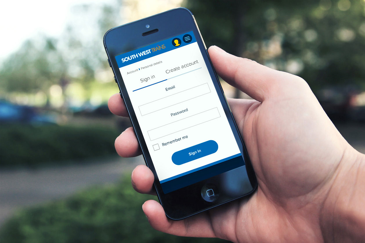
Joining The Zone Agency on a contract as a lead UI designer, I began work on Phase 2 of the large-scale replatforming of the South West Trains website, which launched in early 2017. The programme focused on modernising the customer experience for one of the UK’s busiest rail operators through a responsive, mobile-first digital platform designed to support both transactional and account-based user journeys.

The project followed a phased delivery approach. While Phase 1 focused primarily on core booking functionality and journey search, my role centred on Phase 2 — designing the authenticated customer experience, including account dashboards, ecommerce flows, smartcard management, and railcard journeys. The objective was to create a seamless and scalable account ecosystem that simplified complex travel management tasks while aligning with established brand and UI guidelines.

Accounts Accounts

UI design

Working closely with Zone’s internal product, UX, and engineering teams, as well as external partners and client stakeholders, I led the design delivery across several key customer journeys. Starting from high-level journey maps and service blueprints, I translated technical requirements and business objectives into polished, high-fidelity interface designs ready for development.

A core part of the role involved rapidly evolving concepts into production-ready experiences within an agile delivery environment. Using established component libraries and contributing new reusable UI patterns where needed, I designed responsive journeys across multiple breakpoints with a strong mobile-first approach. This included end-to-end flows for registration, login, My Account dashboards, saved journeys, smartcard management, and railcard functionality.

Accounts Accounts

High fidelity

Using an established component library, I defined user flows, interactions and error states, and responsive design for developer handoff, creating clickable prototypes and ensuring all deliverables were implementation-ready and aligned with the wider design system. Collaboration with developers was highly iterative, enabling quick feedback loops and ensuring design intent was maintained throughout build and QA phases.

One of the key challenges of the project was balancing operational complexity with ease of use. Rail travel platforms often involve fragmented user journeys, technical constraints, and dense information architecture, so a major focus was simplifying customer interactions while maintaining clarity across transactional and account-management tasks. Through close collaboration with product and technical teams, we identified friction points early and refined journeys to improve usability, consistency, and accessibility across devices.

Accounts Accounts

Shipping

The project also required strong stakeholder management and communication skills, as designs needed to move quickly from concept to client approval within tight delivery timelines. I worked closely with stakeholders to visualise solutions rapidly, gather feedback efficiently, and iterate designs without compromising quality or scalability.

The final product delivered a significantly more modern and intuitive digital experience that improved how customers managed journeys, accounts, and travel products online. The work established scalable design patterns that supported the wider platform ecosystem while helping modernise the overall customer experience for one of the UK’s leading rail operators.

Accounts Accounts

Across the wider UK rail industry, digital and mobile ticketing (like eTickets and apps) saw a massive surge in 2017, with the Rail Delivery Group reporting over one million eTickets sold industry-wide in just the first six months of that year.

— Digital Market Growth
Accounts
Next case study
Cynergy Bank - AI powered banking applications
Ecommerce2021

Nintendo UK Store

Supporting the UX Delivery of Nintendo’s Mobile-First Ecommerce Platform

Client
Jellyfish Agency · Nintendo UK Store
Duration
3 months
My role
Senior UX/UI Designer
Team size
6
Nintendo UK Store

Supporting UX

While contracting on the BT project at Jellyfish, I contributed to the redesign and replatforming of the new Nintendo UK Store, which launched in 2021. The project focused on modernising Nintendo’s ecommerce experience through a mobile-first approach designed to improve customer engagement, streamline purchasing journeys, and better support the evolving ways users discover and buy games online.

Joining the project during active delivery, I worked in a supporting Lead UX/UI capacity within an established multi-disciplinary product team. My focus was primarily on the content experience across the platform, helping shape responsive content journeys and scalable UX patterns that aligned with the wider ecommerce ecosystem.

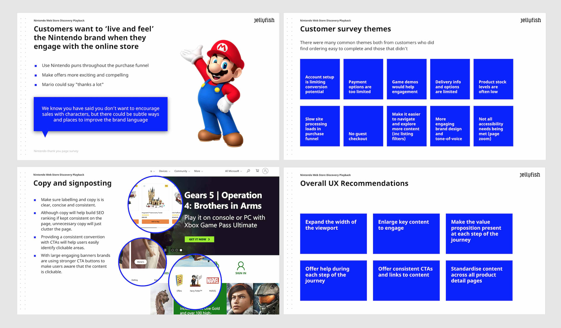
Research

UX design

Working closely with product managers, UX leads, developers, and client stakeholders, I translated research findings and business requirements into responsive wireframes and UX flows using Figma. This included designing and implementing reusable content components, refining responsive layouts, and ensuring consistency across mobile and desktop experiences.

A major objective of the replatforming initiative was addressing the shortcomings of the previous platform, originally launched in 2013, which no longer met modern ecommerce expectations — particularly on mobile devices. User behaviour had shifted significantly towards mobile browsing, content consumption, and purchasing, making a mobile-first strategy essential to improving engagement and conversion.

Module templates

Wireframing module templates

The redesigned experience introduced a far more modern and flexible content ecosystem, with a stronger emphasis on rich media, personalisation, and responsive interaction patterns. Video content became a much more prominent part of the customer journey, requiring mobile-optimised content modules, responsive media handling, and scalable component behaviour across different screen sizes and content types.

Working collaboratively across UX, visual design, and engineering, I helped ensure that content experiences integrated seamlessly with broader ecommerce flows, including navigation, discovery, and checkout journeys. A key focus throughout the project was maintaining clarity and usability across increasingly content-rich experiences while reducing friction in the path to purchase.

Module templates Module templates

Execution

Because the platform served a large and highly engaged gaming audience, consistency and familiarity in interaction design were critical. We relied heavily on user research conducted by Jellyfish to validate interaction patterns, content hierarchy, and navigation structures, helping create experiences that felt intuitive and performant across devices.

The final platform delivered a significantly improved customer experience compared to the legacy store, with faster and more consistent responsive journeys, improved mobile usability, enhanced discoverability of products and content, and a more streamlined checkout experience. The redesign also supported broader commercial objectives by helping reduce basket abandonment and improving engagement with Nintendo’s expanding catalogue of digital and physical products.

Module templates

Reflections

Having previously worked on enterprise gaming platforms for Sony PlayStation, contributing to Nintendo’s ecommerce ecosystem provided further experience designing for large-scale gaming audiences and reinforced my expertise in creating scalable, user-centred digital products within highly recognisable global brands.

Module templates
Site replatforming Site replatforming

Able to be client-facing as well as graft behind the scenes, I would recommend Brandon to anyone needing a solid pair of hands to guide the UX aspects of their projects.

— Head of UX, Jellyfish
Next case study
Cynergy Bank — AI powered banking applications
EcommerceEnterprise2020

Preqin.com

Transforming an old .Net platform into a slick CMS and Shopify driven ecom experience

Client
Preqin · Blackrock
Duration
6 months
My role
Lead UX/UI Designer
Team size
12
Preqin

Replatforming preqin.com - an old .net platform

As a Lead UX/UI Designer, I played a key role in the redesign and replatforming of the global Preqin website, launched in 2020. Preqin is one of the world's leading providers of data and intelligence for the private capital market, supporting investors, hedge funds, fund managers, and financial institutions with critical market insights — including the growing demand for ESG (Environmental, Social, and Governance) investment strategies.

The project centred around transforming an outdated, hard-coded .NET platform into a modern, scalable, and fully responsive digital ecosystem. The legacy website lacked CMS flexibility, was not mobile-optimised, and created significant operational bottlenecks for the marketing team. Our objective was to design and deliver a future-proof platform that empowered internal teams while significantly improving the user experience across content discovery, ecommerce, and event engagement.

Process flow

A platform holding the business back

The legacy platform presented three compounding problems. First, the hard-coded .NET architecture meant every content change required engineering involvement, creating a bottleneck that slowed the marketing team's ability to respond to market events and campaign opportunities. Second, the site was not mobile-optimised — a significant gap for a global audience of investment professionals accessing data across devices. Third, there was no integrated ecommerce or events capability, forcing workarounds that fragmented the user experience.

The new platform needed to solve all three simultaneously: introduce CMS flexibility, deliver a fully responsive experience, and integrate ecommerce and events into a single coherent ecosystem.

Process flow Process flow Process flow

End-to-end UX strategy and delivery

Working from concept through to delivery, I helped lead the UX strategy and interface design process across the full product lifecycle. The new platform introduced:

  • A fully editable CMS architecture integrated with Preqin's Amazon cloud-based data infrastructure
  • A custom events engine for managing and promoting global events
  • Full Shopify ecommerce integration for data subscriptions and publications
  • A scalable design system and visual language to support long-term platform growth

The result was a far more agile and scalable experience that enabled the marketing team to independently manage content, campaigns, and ecommerce workflows without development dependency.

Process flow

Agile delivery at pace

Collaborating closely with stakeholders, developers, product teams, and marketing leadership, I worked in agile sprint cycles alongside an offshore engineering team in Ukraine. Operating one to two sprints ahead of development, I created detailed user flows, service blueprints, wireframes, and high-fidelity clickable prototypes in Axure RP to align business goals with technical feasibility and user needs.

I also partnered closely with UI designers to evolve the visual language and establish scalable style guides that improved consistency across the platform.

"Operating one to two sprints ahead of development kept design quality high without ever blocking the engineering team."

— Project approach, Preqin replatform
Process flow

Letting data lead the design decisions

A major focus of the project was leveraging analytics and user insight to inform design decisions. Because this was a replatforming initiative, we had access to substantial behavioural data from the existing platform — including usability testing findings, heatmaps, and Google Analytics. This allowed us to identify key friction points across user journeys, particularly within content discovery and ecommerce flows.

By analysing navigation behaviour, engagement hotspots, and drop-off patterns, we were able to redesign critical pathways to:

  • Improve content discoverability across research and data products
  • Streamline ecommerce interactions and reduce checkout friction
  • Optimise high-traffic landing pages for conversion across devices
  • Reduce cognitive load across complex multi-step journeys
Process flow

Bridging design, engineering, and business

Throughout the project, I facilitated collaboration between UX, UI, engineering, and business stakeholders, ensuring design quality remained high through iterative testing and continuous refinement. This required balancing the ambitions of marketing leadership with the technical constraints of the engineering team — often translating complex requirements into clear, deliverable design decisions within tight sprint timelines.

Following launch, we continued evolving the platform through usability feedback, responsive optimisation, and ongoing improvements to the design system to support future scalability.

Process flow

A platform built for growth

The outcome was a modern, responsive enterprise platform that significantly improved usability, operational efficiency, and content management flexibility — positioning Preqin to better support its rapidly growing global audience and digital product ecosystem.

Key outcomes included:

  • Full CMS control returned to the marketing team without engineering dependency
  • Mobile-optimised experience across all content and ecommerce journeys
  • Integrated Shopify ecommerce and custom events engine within a single platform
  • Scalable design system and style guide supporting ongoing product development
  • Measurable reductions in friction across key content discovery and conversion pathways
Next case study
Nintendo’s Mobile-First Ecommerce Platform

AI

Pushing the envelope with Claude Code

Brandon Botha May 2026 8 min read
Claude Code

Building and optimising using Claude Code

Before I kick off, please note that this entire portfolio website was built and optimised using Claude Code. I had an idea of what I wanted and used Claude to make those ideas tangible. I worked closely with Claude and downloaded the outputs, edited them in VS Code and uploaded my package to my cloud hosting agent. This is a snapshot of my old site.

Claude Code Background

Anthropic launched Claude in March 2023, but it wasn’t until the February 2026 release of Claude Code that the product design community really began paying attention. Claude is trained using Anthropic’s “constitutional AI” approach — designed to improve ethical reasoning, safety, and alignment — but for UX and product designers, the real breakthrough has been its ability to accelerate ideation, prototyping, and front-end product development.

It's like someone removed the roof. There are now no limits.

For designers working across UX, UI, and product strategy, Claude represents a shift in how digital products can be explored and built. Rather than relying solely on static wireframes or off-the-shelf website templates, designers can now collaborate directly with AI to rapidly generate working interfaces, coded prototypes, and scalable front-end experiences.

The name “Claude” itself is reportedly inspired by Claude Shannon, reflecting the platform’s roots in information systems and human-computer interaction.

Building Products and Prototypes with Claude

From a product design perspective, Claude’s greatest strength is its ability to bridge the gap between design thinking and functional implementation.

I built this portfolio website almost entirely through iterative collaboration with Claude over the course of a few days. What would previously have involved sourcing a suitable WordPress theme, heavily customising templates, and navigating plugin limitations became a far more fluid process: describing ideas, refining layouts, adjusting components, and generating production-ready front-end code in real time.

For experienced UX/UI designers, this fundamentally changes the speed of iteration.

Instead of spending days configuring templates, Claude enables a much more direct workflow:

  • Define the product vision
  • Generate initial layouts and structure
  • Iterate collaboratively through prompts
  • Export and refine the codebase
  • Scale the experience into a complete product ecosystem
Before and after using Claude Code

The process feels closer to art direction or creative collaboration than traditional website development.

That said, Claude is most effective when paired with at least a foundational understanding of front-end development. Working with generated HTML, CSS, or JavaScript still requires a designer’s judgement and technical fluency. Fortunately, having spent years hand-coding websites earlier in my UX career, I found the transition into AI-assisted product building surprisingly natural.

What stood out most was the speed. Within less than an hour, I had generated a functioning prototype that later evolved into a fully realised portfolio platform. After exporting the generated files into Visual Studio Code for refinement, I was able to scale out the portfolio structure, blog system, and supporting pages over the following days.

AI as a UX Design Critique Partner

Claude is often discussed as a tool for rapid prototyping, but increasingly it is also being positioned as a design collaborator — capable of analysing UX flows, identifying friction points, and providing critique.

I wanted to test how valuable that capability really was from a senior product design perspective.

Over the last few months, I’ve been experimenting with Claude as a UX review companion, feeding it exported product flows and interface journeys directly from Figma.

Currently, Claude only accepts flattened assets such as PDFs, JPEGs, or PNGs. This does create friction for designers working in native Figma or Sketch environments, particularly when exporting large-scale workflows containing dozens or hundreds of screens.

To test its analytical capabilities, I provided Claude with a first-pass workflow for an Agentic AI deal management platform — specifically a credit memo and document collection journey.

The design intentionally contained unresolved UX issues:

  • Overuse of binary Yes/No interactions
  • Weak progress visibility
  • No bulk-skip functionality
  • Missing onboarding/introduction states
  • Absence of defined error handling
  • Inconsistent system guidance patterns

The flow was intentionally imperfect — ideal for evaluating whether Claude could identify meaningful UX concerns beyond surface-level observations.

What Claude Identified

Claude evaluated:

  • Cognitive load
  • Interaction repetition
  • Navigation hierarchy
  • Workflow progression
  • Search scalability
  • AI guidance consistency
  • Visual communication patterns
  • Content clarity
  • Even typographic errors
What was sent through to Claude Code

Many of the observations aligned with concerns I had already identified internally. However, several recommendations genuinely helped shape the next iteration of the product experience.

Some of the strongest insights included:

Reducing Repetitive Interaction Patterns

Claude identified that repeatedly asking users “Do you want to add X?” created unnecessary cognitive fatigue and fragmented the workflow.

Its recommendation to consolidate document collection into a unified checklist experience with statuses and visibility was particularly strong from a systems-thinking perspective.

Improving Workflow Transparency

The feedback around persistent progress tracking was also valuable.

Rather than isolated step labels, Claude recommended a persistent journey overview showing completion percentage and overall “credit memo readiness” — a much more scalable approach for complex enterprise workflows and multi-session user journeys.

Clarifying AI vs Manual Actions

One particularly useful observation was the ambiguity between AI-fetched data and manually uploaded documentation.

Claude suggested introducing a distinct visual language to differentiate automated retrieval from user-uploaded content — a small but important UX improvement that strengthened trust and reduced ambiguity within the workflow.

Encouraging Earlier Value Delivery

Another notable insight was the suggestion to surface draft credit memo generation earlier in the process, rather than gating it behind full completion.

From a product strategy perspective, this aligns strongly with progressive value delivery — allowing users to begin reviewing outputs while workflows remain incomplete.

After implementing feedback from Claude Code

Design Iteration and Human Judgement

Following the review, I produced a second design iteration informed by both my own observations and Claude’s recommendations.

One of the most useful additions was persistent AI guidance throughout the experience — contextual explanations helping users understand why specific data or documents mattered within the assessment process.

What became clear during this exercise is that Claude works exceptionally well as a UX sparring partner.

It can:

  • Highlight usability risks
  • Reinforce product thinking
  • Surface overlooked friction
  • Accelerate iteration cycles
  • Challenge interaction patterns
  • Provide structural critique

For junior and mid-level designers, this kind of feedback loop could function almost like an on-demand design mentor.

For senior designers, the value is different: validation, acceleration, and perspective.

Where Claude Still Falls Short

Despite its strengths, Claude is not a replacement for experienced product design judgement.

When asked to generate its own fully designed React implementation of the workflow, the output was technically impressive but visually weak.

The generated interface suffered from several common AI-design problems:

  • Poor accessibility contrast
  • Inconsistent typography
  • Erratic colour treatment
  • Weak visual hierarchy
  • Unrefined spacing systems
  • Unclear component consistency
Highlighting some issues with Claude output

This highlighted an important distinction:

Claude is significantly stronger at identifying structural UX issues than it is at producing polished, accessible, production-quality interface design.

In many ways, it behaves more like a highly capable product strategist or UX reviewer than a mature visual designer.

And that’s where the balance currently sits:

  • AI accelerates execution
  • AI improves iteration velocity
  • AI enhances critique cycles
  • Human designers still define quality

The Future of AI-Assisted Product Design

For product designers working in lean teams or fast-moving environments, tools like Claude are beginning to reshape the entire product development workflow.

The traditional gap between:

  • idea,
  • wireframe,
  • prototype,
  • and coded implementation

is collapsing rapidly.

Claude enables designers to move from concept to functioning prototype in hours rather than weeks, dramatically reducing friction between UX thinking and product delivery.

The real opportunity isn’t replacing designers — it’s augmenting the design process itself.

Used well, Claude becomes:

  • a prototyping engine,
  • a UX reviewer,
  • a development accelerator,
  • and a collaborative thinking partner.

The designer still provides the strategic thinking, visual refinement, accessibility standards, and product intuition.

But the speed at which those ideas can now become tangible experiences has fundamentally changed.


Fintech

Why most fintech apps feel like they were designed for compliance, not people

Brandon Botha March 2026 8 min read
All fintechs look the same

After 15 years designing financial products, I've noticed the same pattern play out again and again. Great technology. Thoughtful engineering. And a user experience that feels like it was designed by a committee of lawyers.

Intro

I've worked with banks, neobanks, and fintech startups across the UK and Europe. The size of the organisation doesn't matter much. Whether it's a 200-year-old institution or a five-year-old challenger, I see the same underlying problem: the design process starts with compliance and ends with the user, when it should be the other way around.

This isn't a criticism of the people involved. Compliance constraints in financial services are real, serious, and non-negotiable. KYC requirements, FCA regulations, PSD2 obligations — these aren't bureaucratic nonsense, they're necessary guardrails. The mistake is treating them as design constraints rather than design inputs.
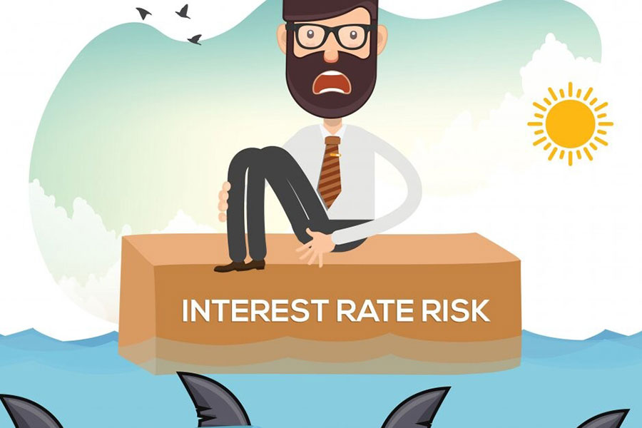
The compliance-first mindset

Here's what compliance-first design looks like in practice. Your team gets a brief to redesign the onboarding flow. The compliance team sends over a list of everything that needs to be collected. A compliance-first team takes that list and builds a form. A people-first team takes that list and asks: what does the customer think we're asking for, and why?
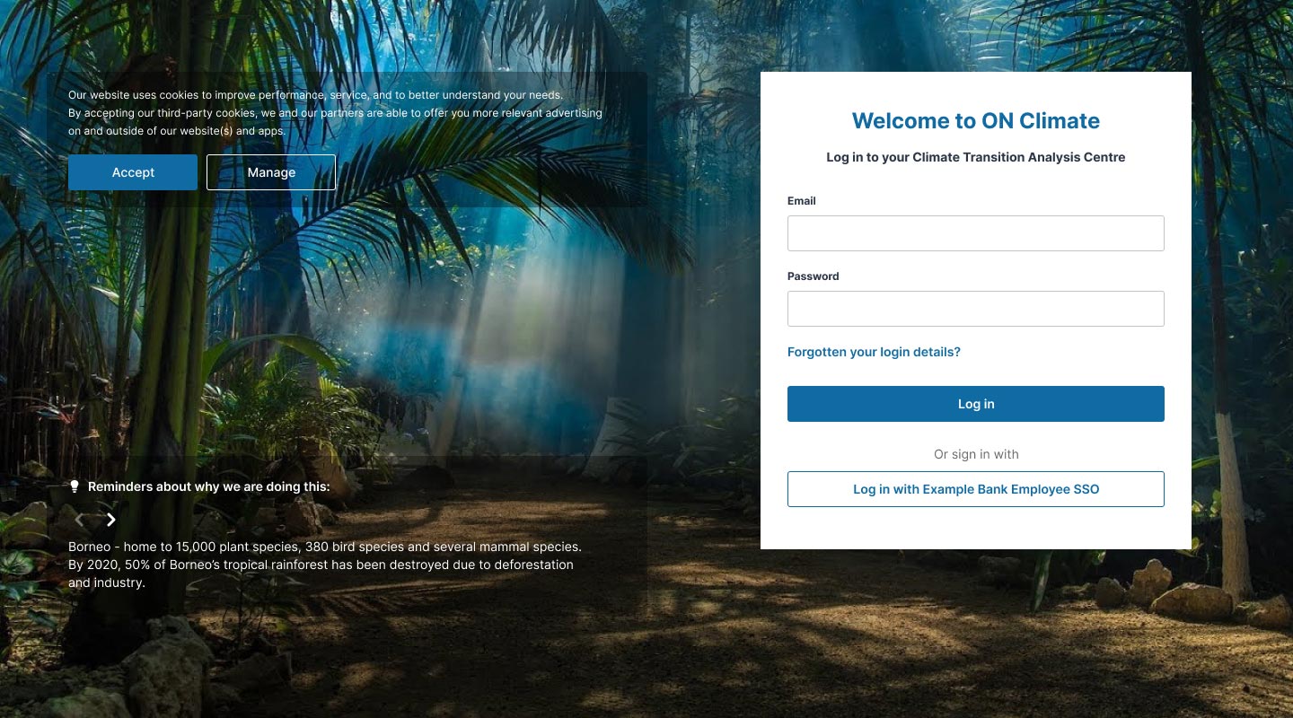
The most common reason customers abandon financial onboarding isn't that the forms are hard to fill in. It's that they don't understand why they're being asked.

All fintechs look the same

Anonymised drop-off data from a client engagement, 2022. The spike at step 6 correlates precisely with the NI number request.

What people-first looks like in fintech

People-first design in a heavily regulated environment doesn't mean ignoring constraints — it means working within them with intention. Here are three principles I return to on every financial product I work on.

  • Explain the why, always. Every data request should be accompanied by a plain-English reason. Not buried in a tooltip — visible, upfront, and honest.
  • Progressive disclosure over front-loading. Collect the minimum to get the customer started, then build trust before asking for more.
  • Design for anxiety, not just usability. Financial products often trigger anxiety. Good fintech design acknowledges this emotional reality.

The structural problem

The challenge isn't knowledge — most fintech design teams know this stuff. The challenge is structural. Compliance teams are typically brought in at the end of the design process, not the beginning. The fix I've had most success with: put compliance in the room from day one.

Where this leaves us

The fintech that treats compliance not as a constraint but as a design input — that explains rather than demands, that reassures rather than interrogates — has a significant competitive advantage. It's also, simply, the right thing to build.

AI

Designing with AI: What’s changed and what hasn’t

Brandon Botha March 2026 8 min read
Designing with AI

A few years ago, AI in design felt experimental. Designers used it to generate moodboards, write placeholder copy, or produce strange-looking UI concepts that were more novelty than production-ready output. That's no longer the case.

Today, AI has become embedded directly into product design workflows. Tools inside platforms like Figma, design systems, prototyping environments, research platforms, and developer tooling are reshaping how teams work from discovery through delivery. AI can now generate wireframes, summarise research, create prototypes, suggest layouts, write code, automate documentation, and accelerate iteration cycles.

But despite all of that change, something important hasn't changed at all: great design is still fundamentally about people. The tools are different. The responsibility isn't.

The biggest shift: speed

The most obvious change AI has introduced is velocity. Tasks that once took hours can now take minutes:

  • Creating first-pass wireframes
  • Generating UX copy
  • Producing UI variations
  • Summarising interview notes
  • Building prototypes
  • Structuring user flows
  • Translating designs into code

Designers are no longer spending as much time on repetitive production work. Instead, AI acts more like a collaborative assistant — helping teams explore more ideas, faster.

This acceleration is already changing how teams operate. Research found that 84% of teams now use or experiment with AI in their workflows, with most reporting noticeable productivity gains.

The design process itself is becoming less linear too. Traditionally, workflows looked something like: Research → Wireframes → UI → Prototype → Test → Build. AI has blurred those stages together. Designers can now move fluidly between ideation, prototyping, testing, and development in near real time. In many teams, the gap between "idea" and "working prototype" has almost disappeared.

Design with AI

Designers are becoming curators, not just creators

One of the most interesting changes is the shift in the designer's role. Previously, designers were responsible for crafting every screen and interaction manually. Increasingly, AI is handling portions of the execution layer. That doesn't remove the need for designers — it changes where their value sits.

The strongest designers today are often the ones who can:

  • Frame problems clearly
  • Ask better questions
  • Direct systems intelligently
  • Curate outputs critically
  • Maintain consistency and quality
  • Apply taste and judgement

AI is excellent at generating options. It is far less effective at knowing which option is actually right.

As design platforms have noted in discussions on AI and design systems, speed without direction can quickly lead to inconsistency and divergence. In practice, this means design craft becomes more important, not less. When everyone can generate interfaces instantly, differentiation shifts toward clarity, systems thinking, interaction quality, accessibility, emotional intelligence, and product judgement.

The messy middle still exists

There's a narrative that AI has "solved" design workflows. It hasn't. In reality, many teams are discovering that AI improves individual productivity faster than it improves organisational clarity.

AI can generate screens quickly, but it cannot automatically solve:

  • Poor product strategy
  • Weak user research
  • Misaligned stakeholders
  • Undefined requirements
  • Broken design systems
  • Inconsistent product thinking

If anything, AI exposes those problems faster. A weak process amplified by AI simply becomes a faster weak process. That's why many experienced product designers are focusing less on prompt-writing tricks and more on strengthening foundational thinking: systems, governance, accessibility, UX strategy, and user understanding.

Research is changing dramatically

User research may be one of the areas seeing the biggest transformation. AI tools can now analyse interview transcripts, identify patterns across large datasets, cluster insights automatically, detect behavioural trends, and generate summaries and recommendations — allowing product teams to process research at a scale that would previously have been impossible.

Design with AI

AI can identify patterns. Humans interpret meaning.

The emotional nuance of why users behave a certain way — frustration, hesitation, trust, anxiety, delight — still requires empathy and contextual understanding. A transcript summary is not the same thing as insight. And insight is where great design decisions come from.

Prototyping has become radically faster

Perhaps the most visible change for product designers is rapid prototyping. AI-assisted tools can now generate interactive flows, responsive layouts, functional UI patterns, early-stage code, and content structures. The result is that designers can test ideas much earlier in the process — instead of spending days polishing static screens, teams can validate concepts quickly and iterate continuously.

This has shifted product conversations away from abstract discussions and toward tangible experiences earlier in the lifecycle. The best teams are using AI not to skip design thinking, but to reach validation faster.

What hasn't changed

Despite all the excitement, the fundamentals remain remarkably stable. Users still want products that are clear, useful, trustworthy, fast, accessible, and emotionally intuitive. AI does not replace the need for critical thinking, product strategy, human empathy, communication, facilitation, prioritisation, or collaboration.

It also doesn't replace accountability. When products fail, confuse users, introduce bias, or create harmful experiences, responsibility still sits with the people designing and shipping them. The most valuable designers in the AI era are not the ones generating the most screens — they're the ones making the best decisions.

The future is probably smaller teams with stronger designers

One trend already becoming clear is that smaller teams can now achieve what once required much larger organisations. AI reduces friction across production, documentation, prototyping, and implementation. That means designers increasingly need to operate more broadly — thinking strategically, working cross-functionally, understanding systems, collaborating closely with engineering, and maintaining quality control.

Ironically, as AI automates execution, human skills become more valuable: taste, leadership, judgement, communication, systems thinking, and ethical decision-making. These are much harder to automate. Even companies heavily investing in AI still acknowledge that AI struggles to match the polish, creativity, and refinement of top designers.

Final thoughts

AI is absolutely transforming design workflows. It's making teams faster, broadening access to creation, accelerating prototyping, and changing how products move from idea to reality. But the core purpose of design remains exactly the same: understanding people and solving problems well.

The tools may evolve every six months. Human needs don't. And that's why design — real design — still matters.

AI

The UX lessons hidden inside the best banking apps

Brandon Botha Dec 2024 8 min read
Best banks

There was a time when banking apps were little more than mobile versions of internet banking. Slow interfaces, cryptic transaction lists, buried actions, and a constant sense that the product had been designed around internal systems rather than human behaviour.

Then came challenger banks like Monzo, Revolut, Starling Bank.

What made these products different wasn't just technology. It was product thinking. They reframed banking from a compliance-first utility into a real-time consumer experience.

And in doing so, they exposed just how far behind many legacy banks had fallen.

The most interesting part isn't the visual design. It's the UX decisions underneath it — the small interaction patterns, feedback loops, and behavioural mechanics that changed how people relate to money.

1. Real-time feedback changed the emotional experience of banking

Traditional banking apps were built around statements. Challenger banks were built around events.

The moment users received instant spending notifications, banking stopped feeling passive. Money became visible in real time.

That sounds simple, but it fundamentally changed user behaviour. Instead of checking balances reactively, users started developing a continuous awareness of spending. Purchases became connected to immediate feedback rather than delayed consequences days later.

Feedback timing matters more than feature count.

Legacy banks often still treat notifications as secondary utilities — generic alerts buried in settings. Challenger banks made them the core experience.

The best fintech products understand that immediacy creates trust. Users feel more in control because the system behaves like a live conversation rather than a monthly report.

UX Lessons

2. They designed around mental models, not banking structures

One of the smartest innovations from Monzo and Starling Bank was the introduction of Pots and Spaces. Technically, these are simple account partitions. Psychologically, they are powerful.

People don't think about money as one balance. They think in buckets:

  • Rent
  • Holidays
  • Bills
  • Emergency savings
  • Disposable spending

Traditional banks historically forced users into rigid account structures because that reflected how banks internally organised money. Challenger banks reversed the model. They organised money the way people already think about it.

Match the system to the user's mental model.

The success of these features wasn't because they were revolutionary technically. It was because they reduced cognitive load. Instead of mentally tracking whether money was "safe to spend," users could externalise that thinking into the interface itself. Good UX often looks like intelligence, but it's usually just reduced mental effort.

UX Lessons

3. The best banking apps removed "administrative friction"

Legacy banking experiences are full of micro-friction:

  • Long authentication flows
  • Delayed transfers
  • Unclear transaction naming
  • Confusing payment states
  • Hidden support
  • Excessive navigation depth

Challenger banks obsessed over removing these moments. Card freezing became a single tap instead of a customer service phone call. Transfers became conversational. Categorisation became automatic. Support became embedded directly inside the app.

These aren't flashy innovations. They're workflow improvements. But users remember friction emotionally. A five-second delay during a payment confirmation creates more frustration than a slightly imperfect visual design ever will.

Users judge experience quality by effort, not aesthetics.

4. They made financial management feel lightweight

Historically, budgeting tools felt like accounting software. Too much complexity. Too much setup. Too much discipline required upfront.

Apps like Monzo succeeded because they made budgeting feel ambient rather than formal. Features like round-ups, spending insights, saving goals, and automatic categorisation quietly guided behaviour without demanding heavy commitment. The interface did part of the thinking for the user.

The best financial products don't try to force discipline through dashboards and spreadsheets. They create lightweight nudges that integrate naturally into everyday behaviour. Good fintech UX reduces shame and increases clarity.

That's a very different design philosophy from traditional banking systems, which often still feel operational rather than supportive.

5. Onboarding became part of the product experience

Many legacy banks still treat onboarding as a compliance task. Fintech products realised onboarding is the product.

The best challenger banking flows introduced:

  • Clear progress indicators
  • Incremental data collection
  • Real-time verification feedback
  • Reduced jargon
  • Immediate value exposure

Instead of front-loading bureaucracy, challenger banks focused on momentum. Users weren't "opening an account" — they were entering a product ecosystem. That distinction matters because onboarding determines emotional confidence. A confusing first-use experience damages trust before the product relationship has even formed.

6. Simplicity is fragile — and many fintechs are now struggling with it

There's an interesting twist to this story. Some challenger banks are now experiencing the same problem legacy banks faced years ago: feature overload.

As products expanded into crypto, investments, insurance, subscriptions, travel, and marketplaces, navigation complexity increased dramatically. Community feedback around newer versions of apps like Revolut and Monzo increasingly mentions clutter, weaker hierarchy, and discoverability problems.

Simplicity is not a permanent achievement. It's a continuous product discipline.

The moment feature expansion stops being curated through strong hierarchy and prioritisation, even excellent products begin accumulating interface debt. In many ways, challenger banks are now entering the same maturity phase that traditional banks struggled with for years.

What legacy banks still keep missing

Most legacy banks have improved visually. But many still misunderstand the deeper shift. The success of challenger banks wasn't driven by modern UI styling. It came from designing around:

  • User psychology
  • Real-time interaction
  • Cognitive reduction
  • Emotional reassurance
  • Behavioural guidance
  • Transparency
  • Speed

Traditional banks often continue designing around organisational structures and compliance processes first, with UX layered on top afterward. The best fintech apps inverted that relationship. They treated experience design as infrastructure — not decoration.

And that's the real lesson hidden inside products like Monzo, Revolut, and Starling Bank.

The future of banking UX probably won't be defined by who adds the most features. It'll be defined by who can keep complexity invisible the longest.

AI

From Prototype to Platform: Designing at Scale in a Banking Transformation

Brandon Botha Dec 2024 8 min read
Best banks

Joining the bank in August 2023 as a contracted Lead UX/UI Product Design Consultant, I became part of a newly formed Transformation Team tasked with modernising the bank's digital experience across mobile, web, and emerging AI-driven services. Working across both strategic and hands-on delivery, I helped shape and launch several firsts for the organisation — from consumer and business banking platforms to early-stage AI initiatives.

App Builds

  • Personal Banking App
  • Business Banking App
  • iOS & Android App v2 Redesigns

As the lead product designer across the mobile ecosystem, I was responsible for defining end-to-end experiences across onboarding, payments, account management, authentication, and servicing journeys. What initially began as a rapid prototype evolved into a fully scaled banking product by its launch in May 2024.

Working within a lean multidisciplinary team, I helped establish the product UX foundations, interaction patterns, and scalable design approaches required to support rapid feature expansion while maintaining usability and accessibility standards.

Online Banking (Web)

  • Personal Online Banking
  • Business Online Banking
  • Open Banking Integrations
  • Multi-Authorisation Payments
  • Bulk Payments Workflows
  • Fast Track Product Applications
  • Online Banking v2 Redesign

Alongside the mobile experience, I led UX/UI design across the bank's new online banking platform. This involved designing complex transactional workflows for both retail and business customers, balancing security, compliance, and operational complexity with clarity and usability.

Particular focus areas included:

  • Multi-authorisation approval flows for business banking
  • Bulk payment experiences for payroll and batch transactions
  • Streamlined "Fast Track" lending and product application journeys
  • Cross-platform consistency between web and mobile ecosystems

The work required close collaboration with engineering, compliance, operations, and stakeholders across the bank to simplify traditionally complex banking interactions into more intuitive digital experiences.

AI & Emerging Technologies

  • AI-Assisted Credit Lending Applications
  • Agentic AI Chat Platforms
  • Conversational Streaming Avatar Experiences

One of the most exciting aspects of the transformation programme was helping the bank explore and launch its first AI-enabled products and internal tooling initiatives. Over the last two years, I contributed to several experimental and production-ready AI concepts, including conversational interfaces, AI-assisted workflows, and agentic support experiences leveraging emerging LLM technologies. This included exploring how AI could improve operational efficiency, customer servicing, and commercial lending experiences.

Scaling the Transformation Team

Between 2023 and 2024, I operated as the sole Principal Product Designer within a small, highly collaborative transformation team. As the programme expanded throughout 2024 and into 2025, the organisation rapidly scaled its digital and engineering functions to support the launch and stabilisation of the bank's new platforms.

As the teams grew, new challenges emerged around consistency, governance, and delivery quality. To address this, I led efforts to modernise and centralise the design workflow by migrating the organisation fully into Figma and rebuilding the design system from the ground up.

A major focus was aligning design and engineering workflows more effectively across Flutter-based applications. Because both the mobile apps and online banking platform were developed in Flutter/Dart, we introduced Widgetbook as a shared component governance layer for developers.

This significantly improved:

  • Component visibility across teams
  • UI consistency
  • Accessibility compliance
  • QA efficiency
  • Design-to-development alignment

Without a centralised component workflow, development teams frequently recreated existing UI patterns independently, leading to fragmented experiences, duplicated effort, and avoidable bugs. Establishing stronger design system governance became critical to scaling delivery sustainably.

By 2026, the transformation programme had matured significantly, and I was leading a small team of designers while contributing across multiple workstreams spanning product design, service design, design systems, and AI innovation.

Highlights

Leading multiple zero-to-one initiatives

Delivered entirely new digital products and services across mobile banking, online banking, AI tooling, and the bank's wider digital ecosystem. The breadth of work ranged from product strategy and UX architecture through to high-fidelity UI delivery and design systems leadership.

Driving cross-functional product ownership

Worked closely with stakeholders, engineers, and operational teams to shape product hypotheses, workshop complex flows, and rapidly translate ideas into production-ready experiences using scalable design system principles.

Shipping AI-enabled banking experiences

Helped the organisation move from early AI experimentation into real product delivery, contributing to conversational AI platforms and agentic workflow concepts that represented entirely new capability areas for the bank.

Designing technically complex financial workflows

Delivered advanced banking functionality including relationship manager meeting portals, multi-authorisation approvals, bulk payment systems, and accelerated lending application journeys — all while maintaining usability within highly regulated environments.

Challenges

Limited user research maturity

One of the largest organisational challenges was the lack of investment in continuous user research and iterative validation. While usability testing was occasionally conducted later in delivery cycles, embedding consistent discovery and testing practices into the product lifecycle remained difficult due to fragmented ownership and limited research funding.

Evolving product leadership structures

Frequent changes within product management created inconsistencies in long-term product strategy and prioritisation. This often introduced delivery friction and reduced continuity across initiatives.

Balancing MVP delivery with organisational expectations

A recurring challenge was aligning stakeholders around lean product delivery principles. Rather than validating smaller, focused MVPs and iterating incrementally, projects often expanded in scope prematurely, increasing delivery complexity and post-launch stabilisation effort.

Driving innovation within regulated environments

As with many financial institutions, innovation frequently needed to be balanced against operational caution and regulatory risk considerations. While the organisation began exploring AI integration, there were opportunities to move faster and more confidently in adopting emerging AI capabilities already becoming standard across the fintech sector.

AI

Endless Discovery and the Road to the OakNorth Credit Intelligence Suite

Brandon Botha Dec 2024 8 min read
OakNorth Bank

As a Lead UX/UI Designer, walking into OakNorth's tech labs felt like stepping into a true startup environment — energetic, collaborative, and full of creative potential. It quickly became one of my most rewarding engagements. I joined early in the product development lifecycle for the ONCI (OakNorth Credit Intelligence) suite and had the opportunity to shape the user experience during a period of intense momentum. From initial development to the first release of ON Climate, we moved at remarkable speed.

Background and Vision

OakNorth had been nurturing a bold vision for risk intelligence tools for over a year before I came on board in early May 2022. Their focus aligned perfectly with my interest in designing for complex risk and financial decision-making domains. The goal was ambitious: develop a suite of applications that could eventually be offered to other banks, not just used internally.

I partnered closely with the Design Director, who had joined a few months earlier and had already run initial discovery workshops and begun shaping a unified direction. The challenge was clear: three greenfield applications were being designed independently by teams in different locations. Our task was to evolve them into a cohesive product family while preserving each app's unique value.

Those three apps became:

  • ON Climate — Analyse climate transition risk on loan books and identify opportunities to lend in support of decarbonisation.
  • ON Scenarios — Model forward-looking risks from macroeconomic shifts and industry events, including stress testing such as interest rate hikes.
  • ON Monitoring — Deliver early warning indicators and real-time monitoring of borrower performance.

All three have since become commercially successful enterprise tools, with adoption by major US banks including Capital One, Old National, and Fifth Third. ON Climate has already earned industry recognition, including a Bronze award for Sustainable Banking at the Qorus Banking Innovation Awards.

The Design Challenge: Creating One Unified Experience

The early priority was to merge three distinct applications into a single, intuitive experience without diluting their individual capabilities. We needed to design for users who would move fluidly between strategic portfolio-level analysis and deep borrower-level insights.

A key architectural decision was adopting a consistent design language and component library across all three apps. While each application lives in its own workspace, they sit within a shared wrapper interface with a side navigation that allows seamless switching. This modular approach proved scalable and has set us up well for future expansion of the suite.

We also refined the information hierarchy. The original vision of a fully interconnected top-down/bottom-up navigation across borrowers, industries, and sectors was compelling but had to be adapted. Because coverage of loan books varied across apps in the early stages, we focused on strong intra-app navigation first, with clear pathways to move between apps. NAICS industry categorisation became a foundational element that tied the modelling engine to familiar banking structures.

Interest Rate Gap Interest Rate Risk

Why These Tools Matter

Banks today face unprecedented uncertainty: $1.5 trillion in mortgages coming due, rising interest rates, geopolitical shocks, supply chain disruption, and tightening climate regulations on the path to Net Zero 2050. Traditional risk tools often look backward. OakNorth's suite provides a true "forward look" — sophisticated modelling that projects how macroeconomic and industry factors will impact individual borrowers and portfolios over 12, 24, and 36 months.

As designers, our role was to make this powerful capability feel approachable and actionable. We focused on clarity, progressive disclosure, and contextual guidance so that busy risk professionals could quickly gain insight without drowning in complexity.

ON Climate turns an existential challenge into a strategic advantage — scanning loan books for climate transition risk, highlighting capital expenditure needs, and surfacing lending opportunities for borrowers preparing for regulatory milestones.

What We Learned from Discovery

We ran extensive discovery and usability testing with professionals across the lending spectrum — relationship managers, portfolio managers, underwriters, chief risk officers, and C-suite leaders. Working with outstanding user researcher Christopher Korintus, we followed a simple but powerful principle: let the user do the talking. No leading questions. Just deep listening.

ON Climate users wanted to:

  • Identify genuine lending opportunities linked to climate transition risk
  • Mitigate their bank's overall climate exposure
  • Stay ahead of regulatory requirements such as FED expectations
  • Quantify potential losses from transition risk
  • Rely on credible, industry-standard models (NGFS)

ON Scenarios users wanted to:

  • Surface hidden risks at industry and borrower levels
  • Run credible stress tests based on adjustable macroeconomic assumptions
  • Model the impact of market shocks including interest rates and GDP shifts

ON Monitoring users wanted:

  • Early warnings when borrowers breach policy
  • A single source of truth instead of juggling multiple systems
  • Significant efficiency gains in annual reviews
  • Broader peer benchmarking beyond their own portfolio
  • Real-time data to support faster, better decisions

Iterative, User-Centred Design

We treated discovery as continuous. Prototypes evolved rapidly based on feedback, always balancing user needs with technical and business constraints. We released scrappy, valuable MVPs and iterated in production — a pragmatic approach that served us well.

The result is a product family that feels cohesive yet specialised. Users can dive deep where needed but maintain a clear mental model across the entire Credit Intelligence Suite.

Great enterprise tools are built through genuine empathy, relentless iteration, and close collaboration between design, research, product, and engineering.

I'm proud of what we achieved at OakNorth and excited to see how the suite continues to evolve.

OakNorth Offices

Ecommerce and AI

Disruptive Tech at Its Finest

Brandon Botha Dec 2024 8 min read
Jellyfish agency

One of the most varied and enjoyable contracts of my career was with Jellyfish in 2020. Even though it was during those dark Covid days where we were all pretty much working from home, during my time there I contributed to two high-profile projects: the ambitious new Digital Marketing Hub for BT Business, and the redesign of Nintendo's UK online store.

The BT Digital Marketing Hub, which launched in November 2021, quickly proved to be a standout product. It empowers small and medium-sized businesses to confidently manage their own social media and digital advertising campaigns — whether they choose a fully managed service or a self-serve "do-it-yourself" approach. The platform has been a genuine game-changer, lowering the barrier to effective online advertising for businesses that traditionally struggled in this space.

In parallel, I supported the launch of the new Nintendo UK Store in early 2021, primarily focusing on content-heavy pages and landing pages alongside designer Ben Luck.

Life at Jellyfish

Jellyfish operates with a strong specialist-team model. The UX team is distributed globally, aligned to client locations. My core team for the BT project was UK-based, primarily in Warrington and London. Due to the Covid-19 pandemic, the entire project was delivered remotely. We never met in person, but maintained strong momentum through daily check-ins and close collaboration.

I reported to Matt Le Gresley and led the UX effort as Lead UX/UI Designer.

End-to-End UX/UI Leadership

The BT Digital Marketing Hub was a complex, dual-sided platform: a customer-facing portal for businesses running campaigns, and a powerful back-office administration hub. My responsibility was to own the full end-to-end UX and UI delivery — from discovery through to release.

This involved:

  • Running workshops with the client and product team to extract requirements and build a prioritised backlog of user stories
  • Translating business and user needs into low- and high-fidelity clickable prototypes in Figma
  • Ensuring every solution was not only user-centred but also technically feasible within scope and budget
  • Continuously refining user stories as technical realities emerged
  • Coordinating user testing and iterating based on real feedback

After an initial research phase led by Matt and supplemented by the client, I took the lead on proving the product hypothesis through design. A few weeks in, I was joined by Senior UX Designer Lorenzo Belluci, whose contributions significantly accelerated progress and quality.

The process followed a clear rhythm: initial design phase → client walkthroughs → six-week user testing programme → further client reviews → development sprints.

User Testing Bonanza

One of the highlights of the project was our rigorous user testing programme. Lorenzo and I built a comprehensive testing plan using usertesting.com, which allowed us to record and review sessions with both anonymous external participants and internal stakeholders.

We tested both the customer frontend and the administration backend extensively. The results were very positive overall — users found the platform intuitive, powerful, and genuinely helpful. Where we identified meaningful friction or opportunities, we workshopped the feedback with the client and implemented changes where they fitted the MVP scope. Bigger ideas were captured as future backlog items.

This iterative, evidence-based approach was key to delivering a product that truly met user expectations while remaining deliverable.

Reflections

Working at Jellyfish reinforced how effective a tight, collaborative, and user-focused team can be — even entirely remotely. Leading the UX on a disruptive platform like the BT Digital Marketing Hub was particularly satisfying. Seeing small businesses gain access to professional-grade digital marketing tools that were previously out of reach made the effort worthwhile.

Both projects were excellent examples of balancing ambitious product vision with practical, testable, and buildable design solutions.

I'm proud of the work we shipped and the positive impact it continues to have for businesses and gamers alike.